From Food Truck to Fast Casual: an Interview with Amanda Maday
Learn what it takes to design a memorable space from owner and lead designer of Studio Grey.
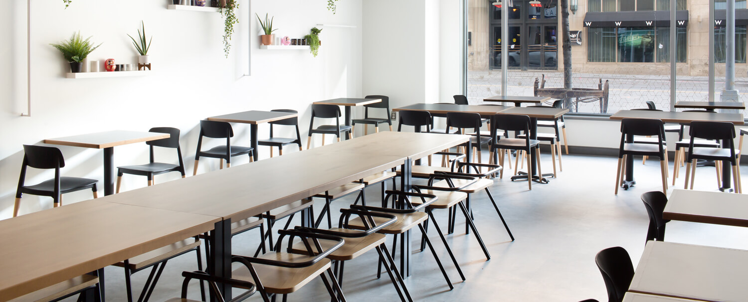
Amanda Maday is the owner and lead designer of Studio Grey in Minneapolis, Minnesota. She and her team have designed a slew of gorgeous restaurants including the Handsome Hog, Gray Duck, and Watson Block event space, to name a few. So, imagine our delight when we got the chance to pick this restaurant designer’s brain about one of her latest projects, Hibachi Daruma, a food truck turned fast casual restaurant and learn what it takes to design a memorable space.
AR: Tell us about about yourself and Studio Grey Design.
AM: Studio Grey is a boutique design firm based in Minneapolis, Minnesota. We’re six years old and woman-owned and operated. Restaurants are our niche, but we also design for hospitality, housing, and corporate spaces through architecture, interiors, and branding.
AR: How did you get into restaurant design?
AM: Prior to starting Studio Grey, I worked at a commercial interior design firm. I’ve also worked in restaurants. I always been drawn to how restaurants are constantly evolving. There is so much to know about the front and the back of the house and how they need to work seamlessly together.
Restaurant design is a difficult market to get in to. I really had to market myself, brand the business, use social media--the whole gamut. Once we landed a couple great restaurant designs, the business took off. Since then, most of our projects have been referrals.
AR: Let’s talk about Hibachi Daruma, the food truck turned fast casual restaurant. What was the inspiration or concept for the design?
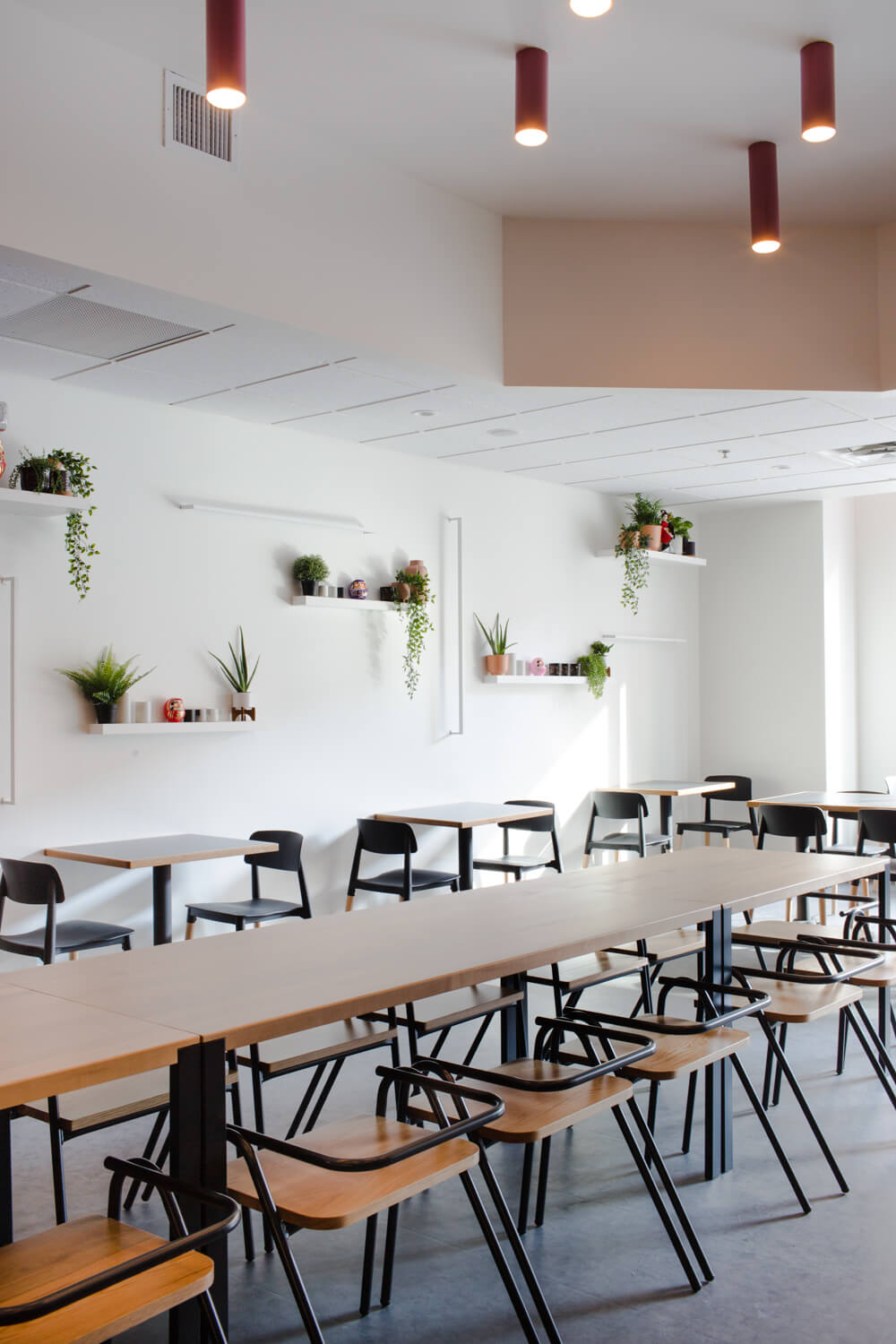
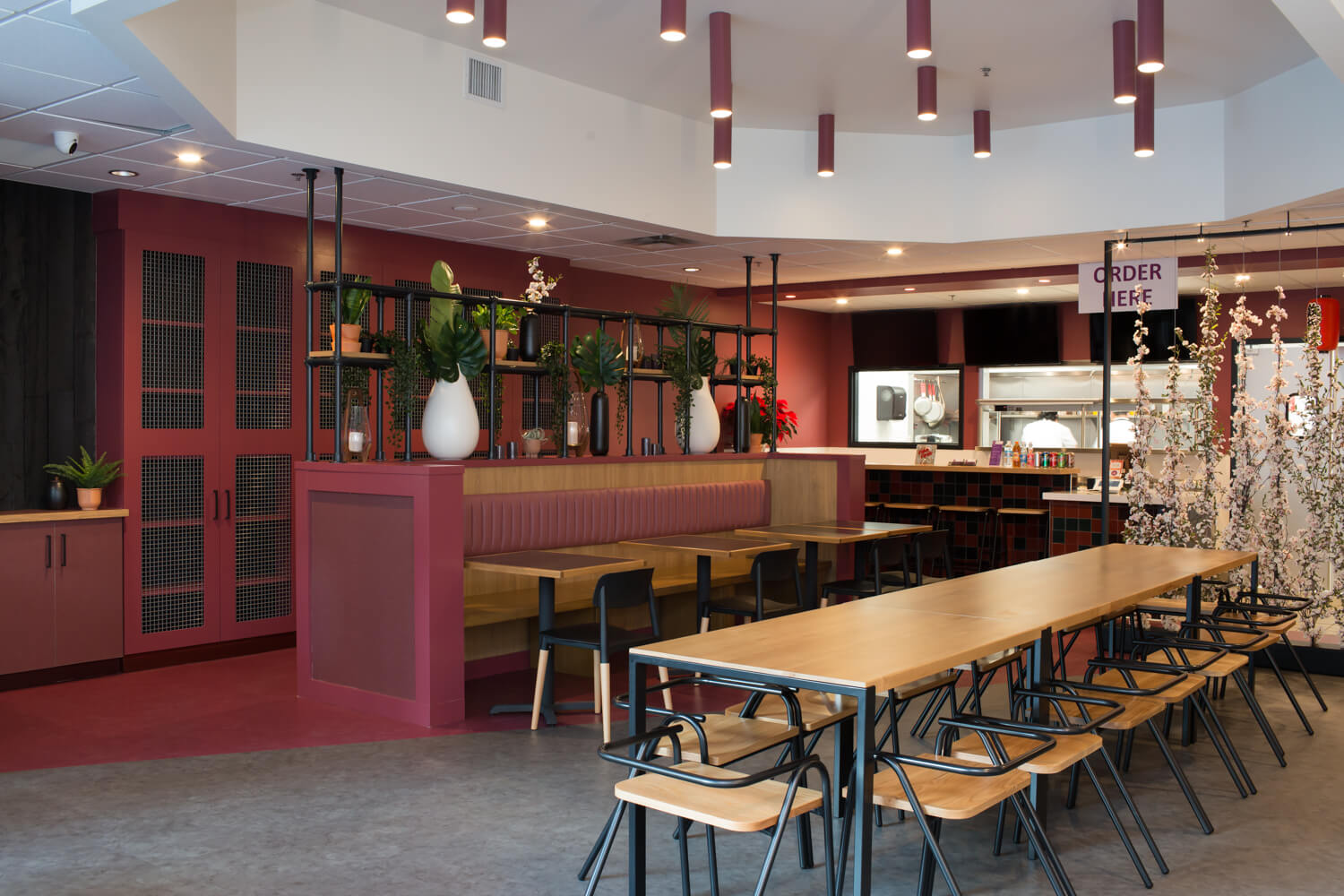
AM: Hibachi Daruma still operates their food truck, but they wanted to create a brick and mortar space where people could comfortably enjoy their food in a sit down setting. We took elements of their truck--the hot pink, the oil pan logo, the black--and scaled it back. For instance, the burgundy paint color was inspired by their playful logo colors. We wanted there to be a pop of color, but also complement the food.
AR: What is it like transitioning a food truck design into a physical space?
AM: With food trucks, their branding has to be loud and eye-catching. But just because the logo or bright colors look great on the truck, doesn’t mean it’s going to translate well for items like paint and fabric. We saturated the colors to be more palatable as an interior finish.
AR: In Hibachi, there’s a lovely bright plant wall and a bold burgundy wall. Both are very photogenic. In other restaurants you’ve designed, you’ll find gorgeous bars and gorgeous upholstery (the green velvet at the Handsome Hog!). As a restaurant designer, do you intentionally design for social media moments?
AM: We always design for Instagrammable moments--it’s free marketing! It gives people access to a space before ever physically stepping foot in it. With each design, we ask ourselves, “besides the great food and service, what is the one feature people will talk about?” The moment people walk up to the door, from the signage to the menus to the interiors and even the restrooms, every detail needs to be on brand every step of the way.
AR: And finally, are there any emerging design trends you see within restaurant and hospitality and are there any you would like to see die?
AM: We try hard not to be on trend. We design with a timeless feel and find the personality of each client's brand. However, we are seeing commercial spaces become multipurpose. Offices and restaurants are starting to feel more residential, public spaces are supporting multiple activities, and amenities are hospitality driven. It’s coming from the need to make spaces more comfortable and familiar to the masses. One key ingredient from Studio Grey is greenery. It's not a Studio Grey space without a bunch of plants!
For trends we’d like to see die, it’s not just the Edison bulb or the barn wood--it’s how it’s used. At Studio Grey, we don’t do cookie-cutter design and we always try to push the boundaries for our clients. Innovation is the key to our success in elevating our client's vision.
To see more of Amanda and Studio Grey’s work, check out their projects here.
