A Beloved Italian Restaurant Gets a Makeover
See how Serafina preserved their “old world” charm while adding a touch of modern sophistication.
There’s always risk when redesigning a beloved restaurant--people don’t like change. So, when Best Practice Architecture embarked on giving Serafina a fresh face and new life, they went bold.
Serafina was founded nearly 30 years ago in Seattle. A treasured Italian eatery—you know the kind—a space filled with nods of red and green and the “old world.” But under new ownership, the vision was to create an establishment just as comfortable and welcome, but with a modern sophistication.

What once was brown and old is now sophisticated, rich, and layered with modern and classic finishes. True to the talents of Best Practice Architecture, the interior is thoughtfully wrapped in color and texture.

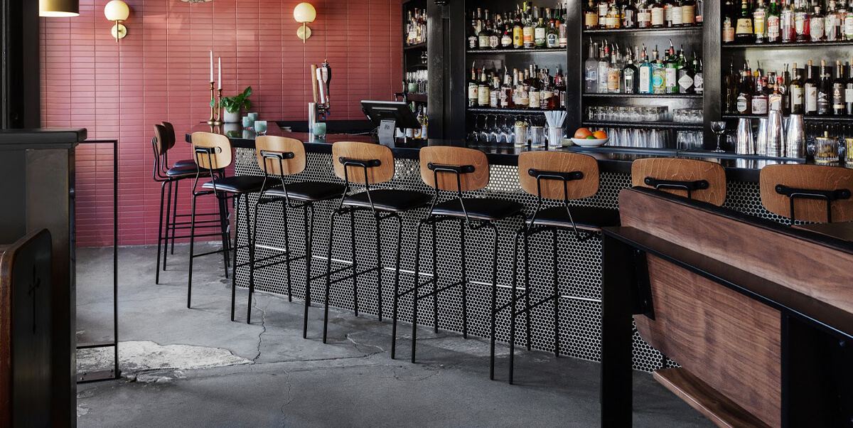
The walls are painted a warm reddish maroon. It’s not just any red—it’s a deep red—similar to my nonna’s Bolognese sauce or your favorite juicy Chianti Classico. For an Italian eatery, the color choice seems obvious yet so sophisticated when paired with striking black, white, and brass accents.
Sleek black penny tiles line the bar while modern Reece chairs and barstools add a mid century vibe. The show-stopping (and personal favorite) black and white checkerboard floor and white table cloths harken to a fine dining experience of yesteryear. It’s classic, but when paired with modern brass lighting and industrial mid-century chairs, it feels nuanced, unexpected, and fresh.

The reason people hate change (redesigns, movie sequels, etc) is that oftentimes the new concept is never as good as the first. With this redesign, it's certainly different and definitely better.
To see more of Best Practice Architecture's work, be sure to check out this modern and colorful doctor's office design.