Inside Iceskimo: This Is What Happens When a Muralist Designs An Entire Restaurant!
Fall in love with Iceskimo’s latest cafe, an exploration of color, soft curves, and retro-inspired furniture.
You may recall the name Janie Rochfort, a.k.a. Betty Larkin from a blog post that we wrote a few months ago that featured 4 muralists that we absolutely adore. Her work combines graphic shapes and dreamy color palettes. Most recently, she applied her unique design perspective to the interior of Iceskimo’s newest location.
Iceskimo, is an emerging restaurant chain that specializes in Taiwanese shaved snow, handcrafted drinks, and other unique Asian treats. Each of their delicious desserts are still made from scratch and the flavors are divine! For those that haven’t heard of “shaved snow,” picture a frozen treat that’s lighter than ice cream and creamier than shaved ice!
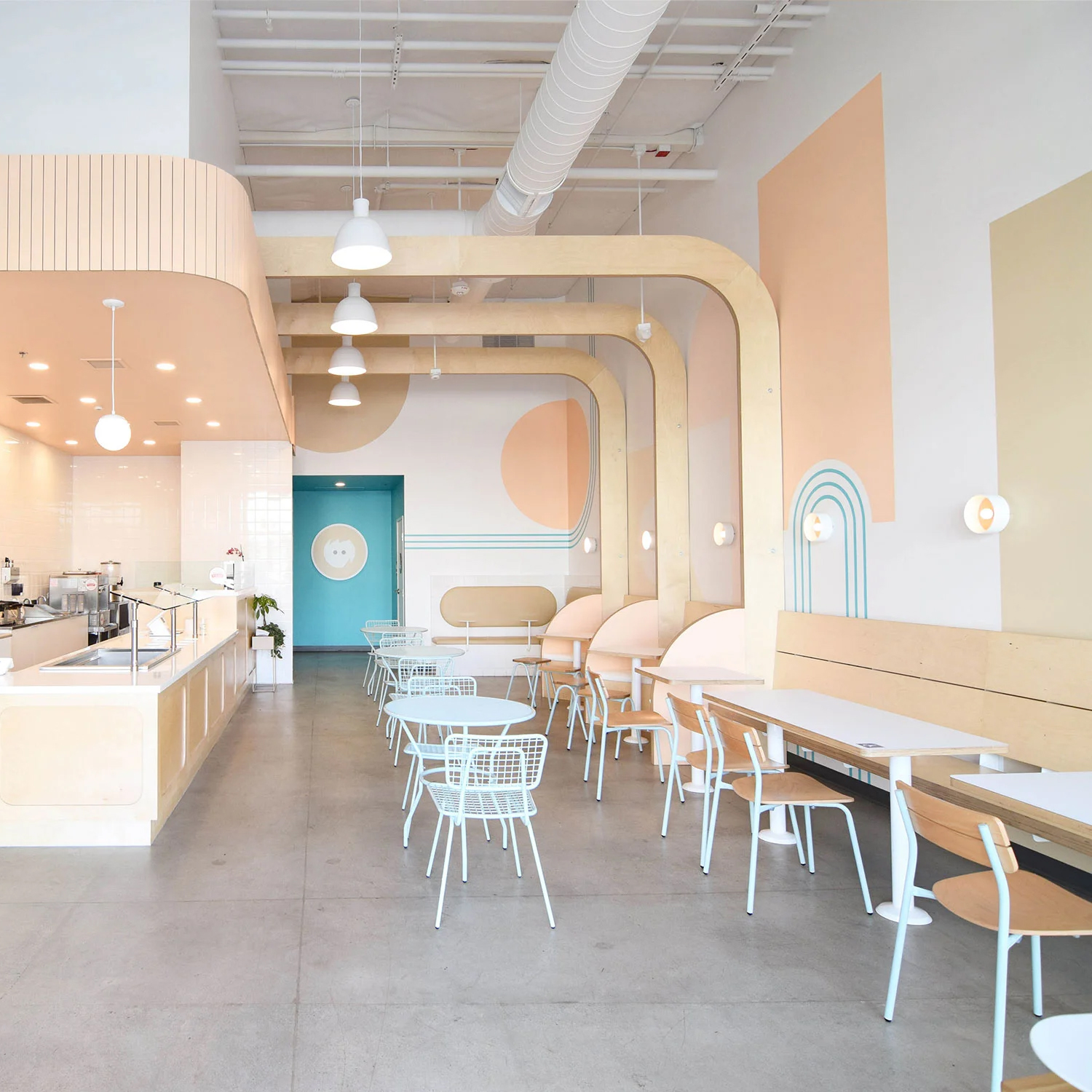
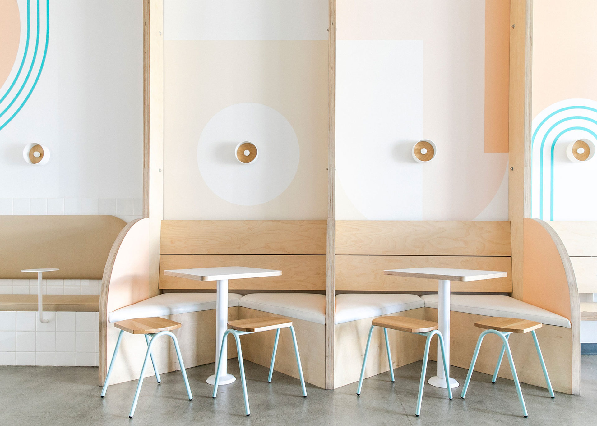
The cafe's interior combines soothing shades of light brown with peach and light blue accents, a nod to the company's branding. The dining chairs are finished in a similar palette of dusty blue and light wood tones.
Janie used a combination of modern chairs and stools as well as a few more retro-inspired outdoor chairs too. While this is the second storefront for the company, it's the first location Janie designed so we sat down with her to learn about the project
When you first landed the project what were some of the key objectives you had to design around?
We worked closely with our client, owner Robert Yang, every step of the way. The space was delivered to us as a cold shell, so we essentially began with a completely blank slate. Yang wanted the space to feel light and bright, modern, playful, and approachable. While the space was his second location, it was an opportunity to develop and reimagine his brand by creating a new yet still familiar experience for his customers. We partnered with James PJ Architects to plan out the service area for staff, and were then able to design the rest of the space to create unique seating areas and spaces for customers to enjoy their desserts.
What was the biggest challenge you faced with the space/design and how did you solve it?
We really had to get creative with how we wanted to allocate our client’s budget. We had to be diligent and intentional about designating funds toward high impact aspects of the design. For example, the custom white oak beams that span much of the wall and curve towards the soffit are a really important piece for the shop; they add a unique architectural element that not only draw the eye upwards, but create definition within the space. This was a crucial element, though it took up a sizeable part of the budget. We were also able to stretch his budget by doing a fun color-blocking mural, which is a high impact piece, but more cost efficient than other options.
You managed to combine some of my favorite GR Chair products in this space, can you tell us what drew you to our products and why you selected the ones you did?
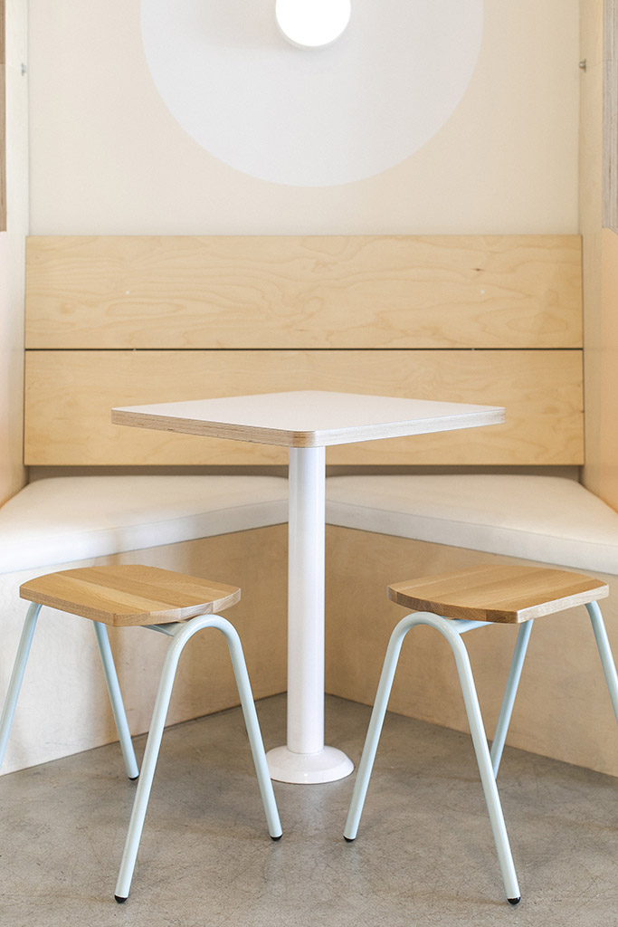
The GR Chairs were one of the first items I sourced for the project! We knew we wanted something that was lightweight, well-designed, and simple. The chairs needed to complement the other white oak seating and our pink partitions, so the Sherman Chairs and Hurdle Stools with the Natural Wood finish and Dusty Blue powder coating were absolutely perfect. The Hurdle Stools are also easy for smaller kids to sit in, which was a priority for us since so many families visit the shop. For the exterior, the Opla Outdoor Chair and Tables in Dusty Blue were the perfect seating options.
Finally, you collaborated with Josh Rice on some of the custom pieces, can you tell us more about that and the role he played?
Yes, Josh Rice of Rice Modern Workshop co-designed the space with me. Josh and I have worked together on several custom furniture and interior design projects over the past 5 years, and we were very excited when Yang asked us to design and build his new location. To have the opportunity to co-design with the same person who is fabricating the custom pieces truly makes for a one of a kind project, and together we were able to create a new take on the Iceskimo brand and image.
To say that we're obsessed with Janie's fresh take on the Iceskimo brand and interior design would be an understatement. She brought her playful and colorful style to this commercial restaurant project and the result is approachable, family-friendly, and modern.
