A Must-See Modern Diner: Inside Clyde’s Fine Diner
Check out Des Moines, Iowa’s latest diner reimagined for the modern day.
Diner design is perhaps my favorite kind of restaurant design. While there are the trendsetting fast-casuals, the stylish farm-to-tables, even the wildly creative 80s concepts, something about a diner puts me at ease. Maybe it’s the simple comfort food or the well-worn, cracked vinyl booth or the gentle tings of spoons swirling into coffee playing like choir handbells. It’s an easy and comforting mix of smells and sounds that feel familiar and fond. Whatever that diner aura is, it’s special.
Which is why I’m thrilled to tell you about Clyde’s Fine Diner in Des Moines, Iowa. The design has that unmistakable diner feel—just reimagined for the modern day.
The Inspiration
Designed by principal and designer Anna Squier of Modern Studio, Clyde’s Fine Diner was inspired by and named after the chef and owner Chris Hoffman’s grandfather, Clyde. Along with the menu, Hoffman’s foodie grandfather was incorporated into many aspects of the design including the classic and clean branding and signage.
The Design
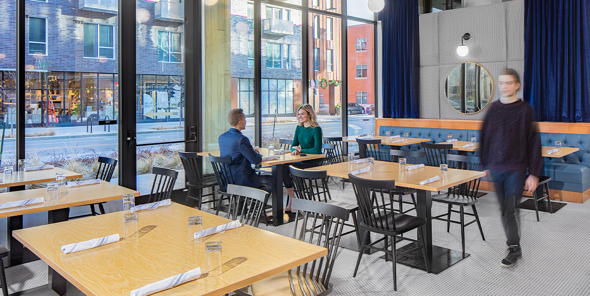
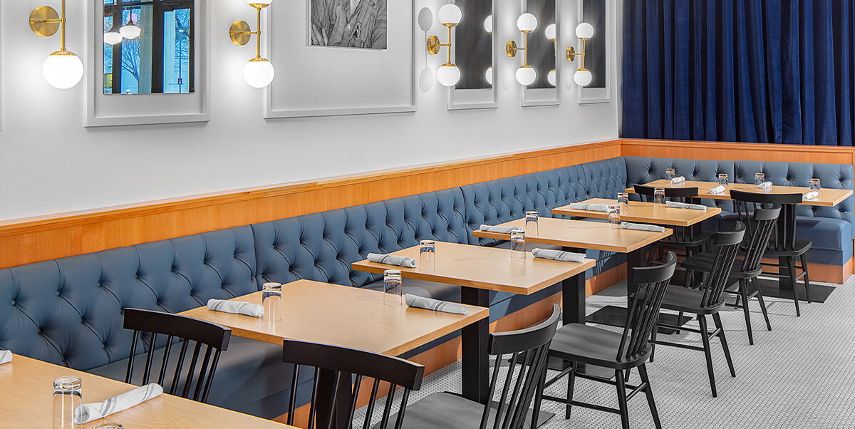
Now, there is a reason the word “fine” is in the restaurant’s name. Although Clyde’s maintains some classic diner elements, each of those elements are interpreted through a refined and modern palette. The swivel barstools, a classic diner nod, gets a luxe update with tufted teal upholstery. The U-shaped bar, the architectural element that anchors the space, features both the nostalgic corrugated aluminum edge and a brass foot rail, yet it’s also topped with a shiny white quartz.
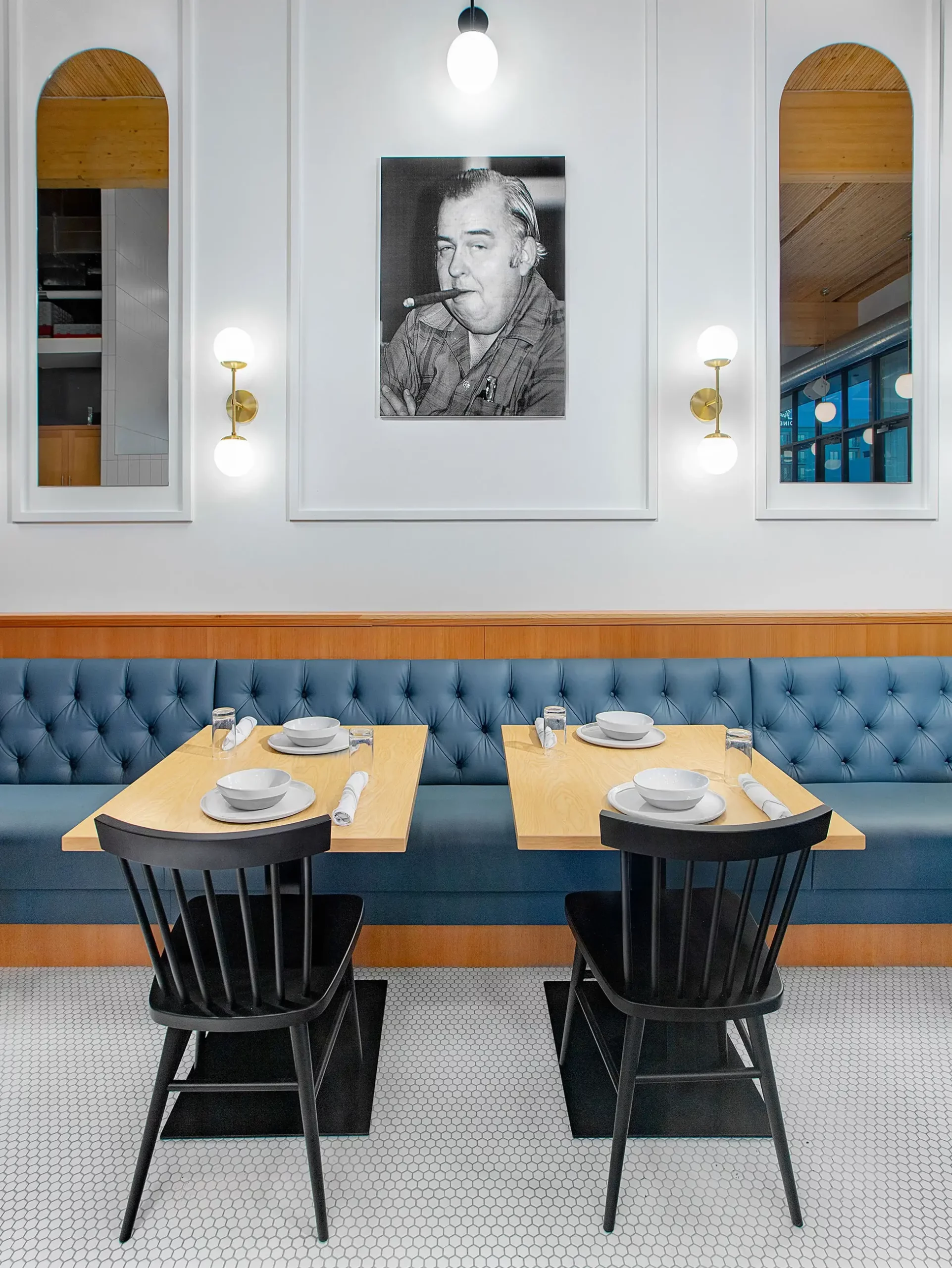
Like Hip City Veg, another modern diner, Clyde’s uses a neutral palette accented with rich teal and blue tones. While black and white harkens back to retro diner floors, the rich wood paneling on the bar, timber beams, and Windsor-style black Hugh dining chairs and sleek diner tables add a modern elegance.
It’s an expert mix of modern finishes and familiar diner moments that give this space depth. Perhaps the most special design detail—and Squier’s favorite element—is the custom neon sign hanging above the kitchen pass-thru. “It’s a custom doodle created by Clyde himself for a G.I. newspaper when he was stationed in San Juan, Puerto Rico. It’s the heart of the space in which everything else fosters from,” said Squier.
Are Diners Making a Comeback?
The diner concept is not revolutionary, but the energy behind revitalizing and reimagining this space seems to be. From Des Moines to Pittsburgh to California and New York, modern diners are popping up in every part of the country. Squier noted, “I think people have a desire to go back to simpler times which leads to the exploration of how to create simpler spaces and support unique ideas through design. This leads to a resurgence in popular design trends from existing eras, including diner designs. A diner comes with the tag of laid back and cool, but with high-end quality food. It is the perfect combination of casual, yet sophisticated people are looking for these days.”
Call out text. Punchcard Building is now evolving into a modern space, revitalizing the iconic structure.
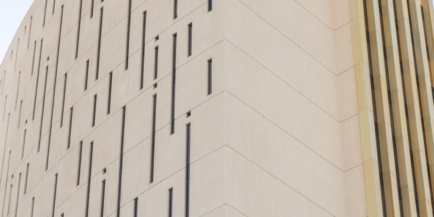
Known to Phoenix locals as the Punchcard Building, the Phoenix Financial Center, holds a unique place in the city's history and has become a recognizable landmark in the Phoenix skyline. Constructed in the 1960s, the building was originally home to banking and financial services and features a facade with narrow windows that resemble punch cards. Falling stagnant in design and improvements after decades of being limited by government leases, the Punchcard Building is now evolving into a modern, multi-use space with the intention of revitalizing the iconic structure
Known to Phoenix locals as the Punchcard Building, the Phoenix Financial Center, holds a unique place in the city's history and has become a recognizable landmark in the Phoenix skyline. Constructed in the 1960s, the building was originally home to banking and financial services and features a facade with narrow windows that resemble punch cards. Falling stagnant in design and improvements after decades of being limited by government leases, the Punchcard Building is now evolving into a modern, multi-use space with the intention of revitalizing the iconic structure

H2 Subhead
Nam liber tempor cum soluta nobis eleifend option congue nihil imperdiet doming id quod mazim placerat facer possim assum. Lorem ipsum dolor sit amet, consectetuer adipiscing elit, sed diam nonummy nibh euismod tincidunt ut laoreet dolore magna aliquam erat volutpat. Ut wisi enim ad minim veniam, quis nostrud exerci tation ullamcorper suscipit lobortis nisl ut aliquip ex ea commodo consequat.
