An Elegant & Cozy Traditional Restaurant Design: The Royal Tern
Find inspiration in the earthy color tones and classic design of Royal Tern.
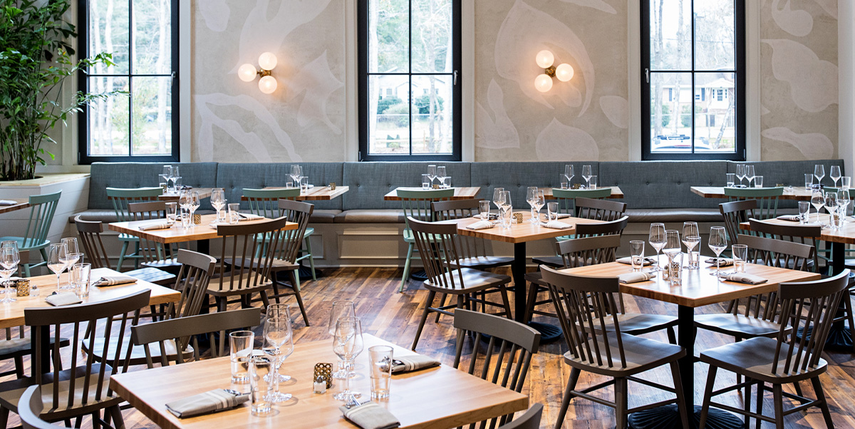
We always here for a modern design moment or a bright pop of color. Take the kaleidoscope-like restaurant or this beachy, citrus-inspired restaurant in Boston. But sometimes, it’s a traditional restaurant design that catches our eye. In this case, it’s The Royal Tern.
Located in South Carolina, The Royal Tern was designed by B. Berry Interiors (who also designed some of our favorite spaces, Workshop and El Thrifty). B. Berry Interiors accomplishes two major things at The Royal Tern. First, she proves traditional style can feel very fresh with the help of updated color palettes and materials. Second, she creates a dining space that feels elevated but not too precious — a key to success for any full-service restaurant.
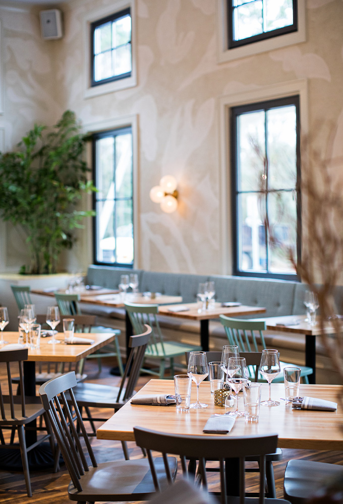
A Fresh Take On Traditional
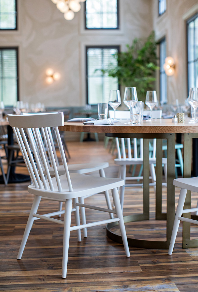
Traditional restaurant design is often synonymous with dark, overbearing woodwork or boring, muted color palettes. While the color story is muted, it’s anything but boring or overbearing. Buff, earthy tones and barely-there blues and grays act as an elegant counterpoint to the rustic wood floors and tables. Classic furniture, like our Hugh chairs, get a fresh treatment with cerulean finishes. Roomy, large circular tables and upholstered booths provide a cozy, familial dining. The walls are plaster, featuring a fresh floral mural by local artist Suzanne Allen brings your gaze directly to the striking oil-rubbed brass chandeliers. All of these elements are technically traditional, yet done with an unexpected, contemporary twist.
Elevated, But Not Stuffy
Perhaps the best part —and what makes the Royal Tern so special—is the overall ambiance. As we said before, we love bold and daring design, but muted, softer, more traditional styles like this can elevate the mood, feeling, and #goodvibes. As modern design becomes more prevalent, we tend to forget about the innate sense of comfort traditional design provides.
B. Berry Interiors captures that comfort, weaving classic individual design elements into one another, creating a space where the design almost becomes background music (really good background music). It’s spaces like this where guests focus more on the food, cocktails, and company. The Royal Tern is elegant and sophisticated, yet lived-in and comfortable. It’s exactly why we continue to dine out.
