Great State Burger: A Contemporary & Colorful Burger Restaurant Design
Find out how this Seattle based burger chain uses color and mixed indoor-outdoor dining to create a youthful dining experience.
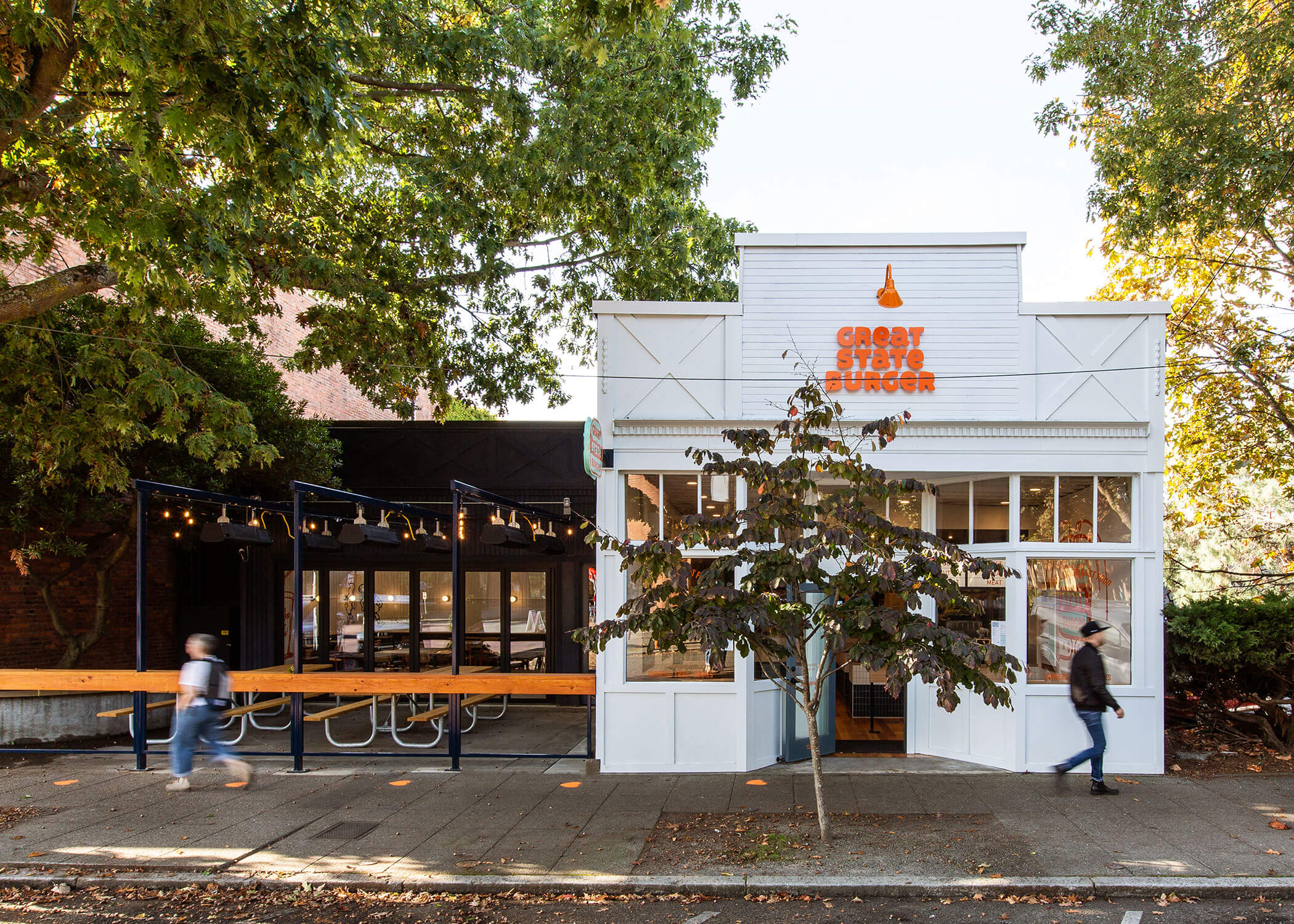
When you Google “burger restaurant design,” you come across a slew of heavy industrialized designs. You know the kind: giant beams of reclaimed wood, unfinished steel, the Edison bulbs. I am not saying it’s bad—it’s just over done. Which makes this next install all that more refreshing. Enter Great State Burger. This Seattle-based burger chain’s latest location has a fresh take on burger restaurant design. Think colorful, crisp, with a nod to the building’s history.
Designed by Best Practice Architecture (who designed this stunning Italian restaurant and this modern healthcare office), Great State Burger boldly goes where few burger joints have gone before. This place uses color, indoor-outdoor dining, and embraces its historical roots to create a happily differentiated burger restaurant design.
Playful Palette
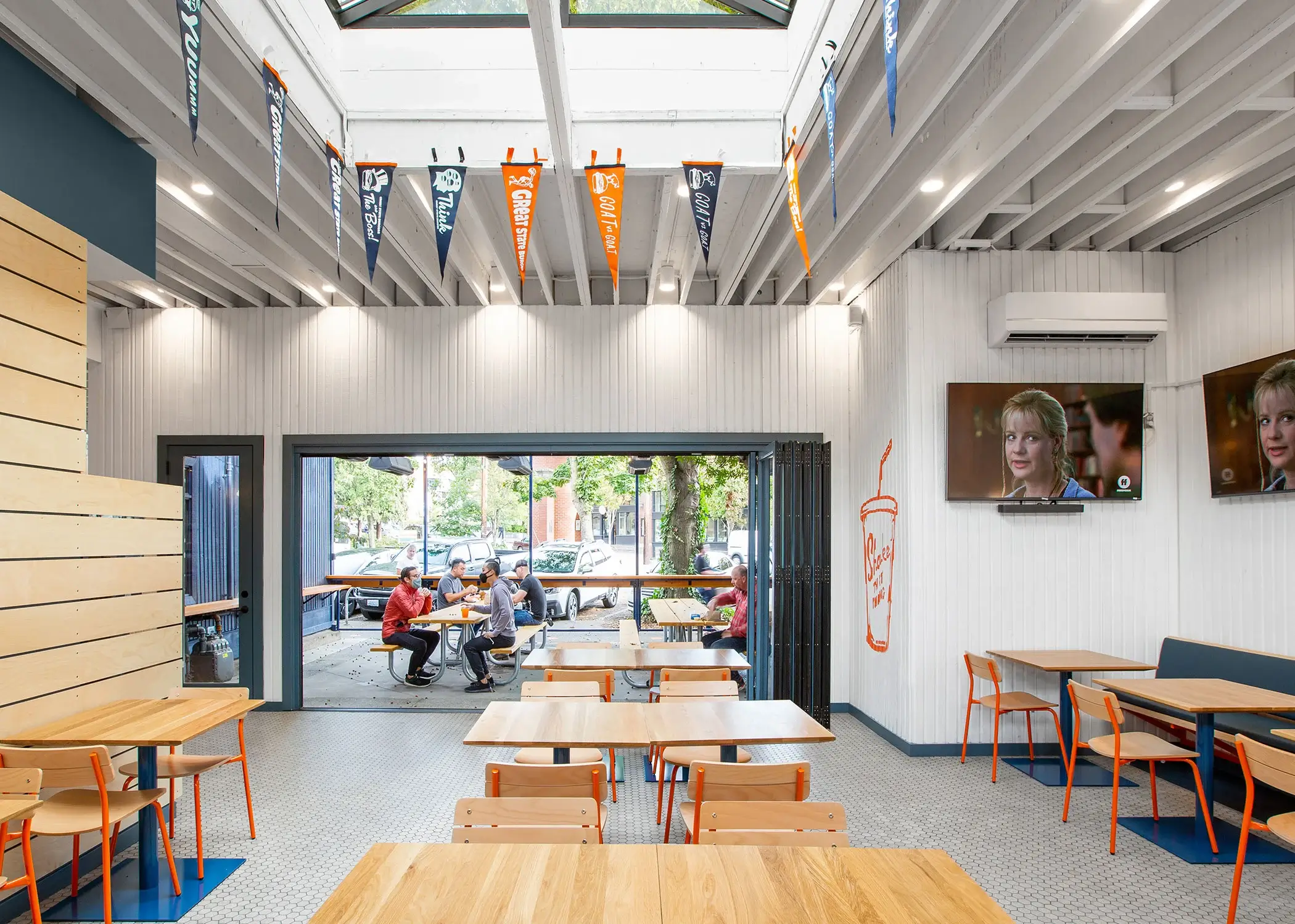
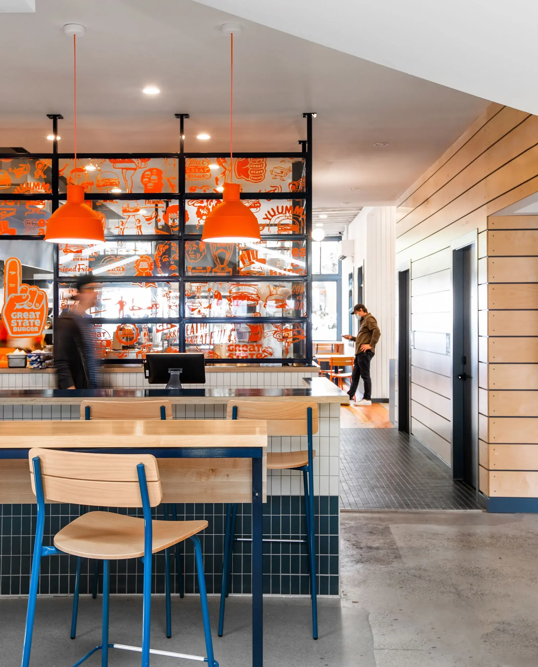
First and foremost, color plays a huge role in the Great State Burger brand. In their other five locations, the Seattle-based chain uses bright blue and red accents to electrify the menu, signage, and interiors. It’s no surprise that their latest location also incorporates bold color. However, at the Ballard Avenue location, the palette leans into cobalt blue and vibrant orange.
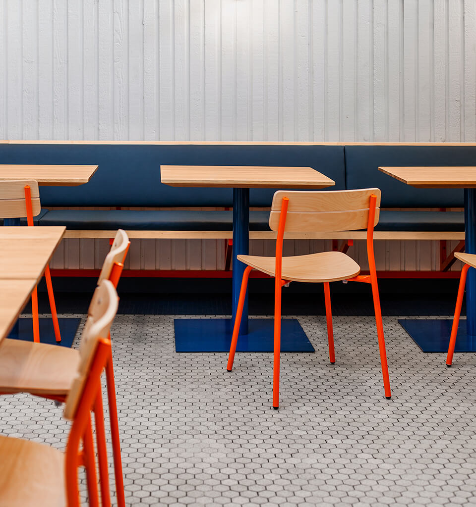
In the order queue and dining areas you’ll find orange wall graphics, orange lighting, and contemporary blue and white subway tiles. Our favorite design element (no surprise here) can be found in the powder coated orange Sherman chairs that pair perfectly with a powder coated blue Brady pedestal tables. Both chairs and tables use a natural stain, letting the painted steel pop. Unlike many burger joints where the design can feel heavy and overly rustic, Great State feels bright, youthful, and energetic.
Burgers Al Fresco
Is there anything better than enjoying a juicy burger and milkshake? Why, yes, there is. Imagine enjoying a juicy burger and milkshake under a lovely pergola complete with sunshine and a light breeze.
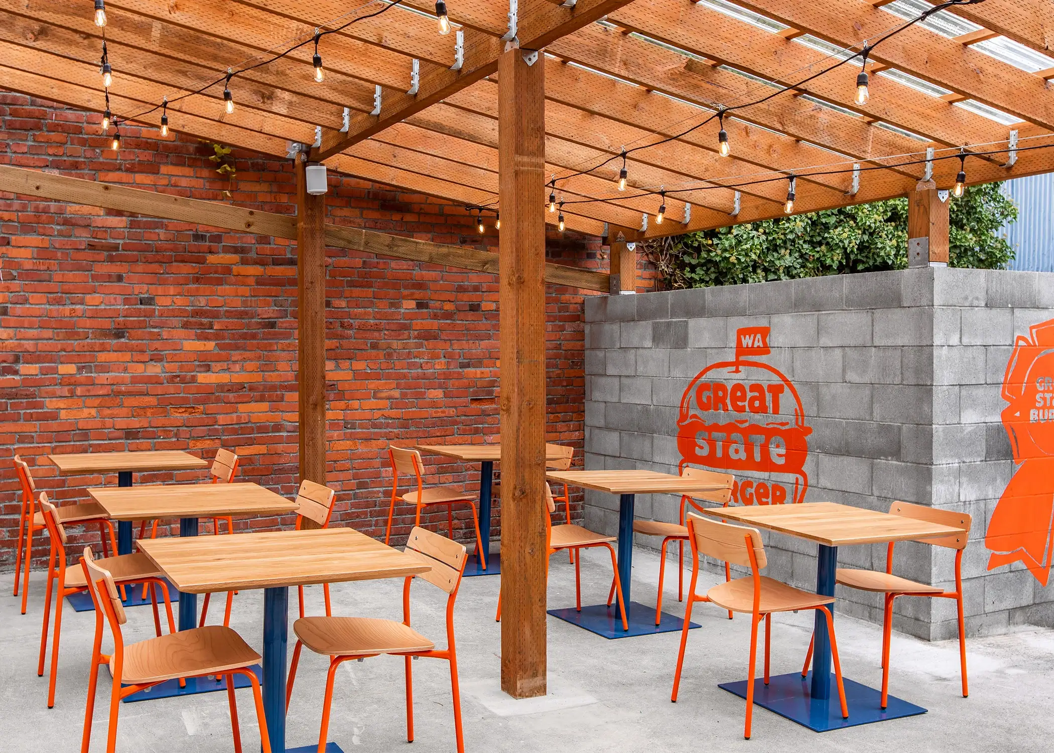
The outdoor space at Great State Burger continues the thoughtful design you find on the interior. The first outdoor space is more of a courtyard, where guests can enjoy their meals on picnic tables complete with string lights. The second space exemplifies indoor-outdoor dining. You’ll find the brightly colored Sherman chairs and Brady tables under a wood pergola-like structure, yet this pergola is enclosed, allowing guests to feel like they are outside without facing the elements. It’s a thoughtful way to continue the design from indoors and create an interesting and layered dining experience.
A Nod to History
Speaking of historic, this Great State Burger opted to plant its roots in a former and historic meat market building. The building itself was constructed in 1895 and was home to the Dill Meat Market Building – a serendipitous connection seeing as Great State prides itself on high quality, local grass-fed beef.
But if we are being honest—it’s the ornate trim and molding detail on the exterior that does it for us. Best Practice used white paint, simple yet modern signage, and vintage-inspired lighting to highlight the ornate and historic building.
To see more inspiring (and unique!) fast casual restaurant design, be sure to check out this spaces:
