Office Break Room Gets a Restaurant-Inspired “Glow-Up”
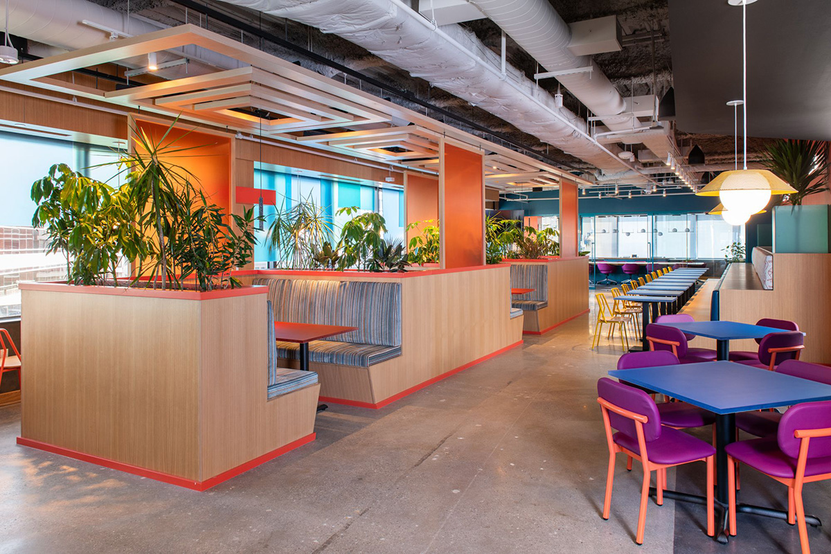
More than just a space to grab a bite, MarginEdge’s ultra-poppy office break room, designed by DesignCase, aims to energize employees with its restaurant-inspired design.
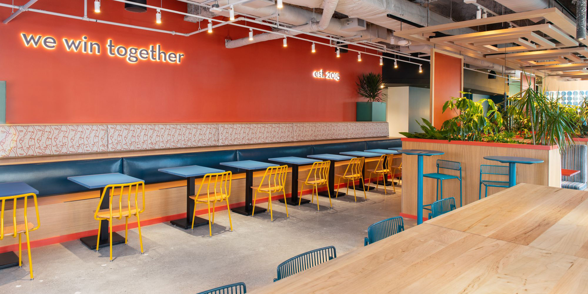
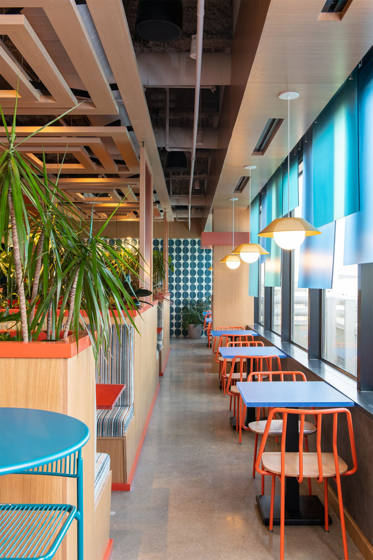
At the heart of MarginEdge’s bustling office lies a break room that defies the norm. This vibrant space isn’t just a place to grab a quick bite — it’s a dynamic environment designed to refresh and inspire employees, transforming lunch breaks into mini-vacations right in the office. Leading this colorful transformation was DesignCase, offering a homage to the restaurant industry MarginEdge serves. More than just a functional space, this break room is crafted to energize employees and infuse lunchtime with a sense of escape and delight.
Behind the Design
Michelle Bove, founder of DesignCase, brings years of experience designing restaurants and commercial spaces. Her journey into restaurant and public space design began in 2006, pivoting from a less-than-thrilling stint designing parking garages. The transition allowed Michelle to find her passion, which shines through in every project she touches.
Restaurant-Inspired Space
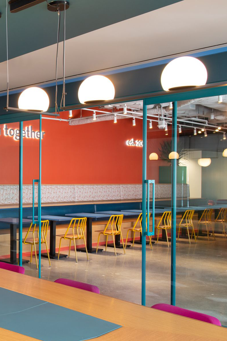
MarginEdge, a company that offers restaurant management software, sought a break room that reflected their brand’s essence. Their goal was clear: create a space that felt more like a restaurant than a typical office lunchroom. They wanted a place where their team, many of whom have backgrounds in the restaurant industry, would feel comfortable and inspired.
Color Bomb — Embracing Vibrancy and Energy
Michelle and her team approached the project with a couple of key concepts in mind. They aimed to create a "Glow Up" — a lunch space that was energizing, avoiding the drab atmosphere of a typical office cafeteria. They also envisioned a "Gut Punch" effect — using bold, bright colors that would not only create an inviting and lively environment but awaken the senses.
The design philosophy behind the space focused on creating a fun daytime restaurant vibe. Understanding that the space would be used primarily during daylight hours, the team embraced the natural light and avoided creating a dim, romantic atmosphere typical of evening dining. Instead, they chose bright colors to create an exciting environment.
The contrast with the rest of the office, which remains neutral and calming, was intentional to create a distinct break area that feels refreshing and stimulating. By incorporating bright pinks, yellows, and blues, the space was designed invigorate, helping employees stay alert and motivated.
A Space to Resonate
The result is a high-contrast space that stands out from the rest of the office, intentionally designed to offer a true break from the workday. The vibrant colors and dynamic design ensure that employees return to their desks refreshed and recharged. The design’s success is evident in how well it aligns with MarginEdge’s brand and its audience. The space not only serves the daily needs of the staff but also impresses visiting chefs and potential clients. By creating an environment that feels like a welcoming restaurant, MarginEdge demonstrates a deep understanding of and connection to the restaurant industry.
