This Mississippi Restaurant is Serving ’90s Fantasy with a Side of Guac
We sat down with designer, Mary Sanders Ferriss, Principal Designer at Ferriss & Company, the Mississippi-based design firm behind the interior to learn how she brought the space to life.
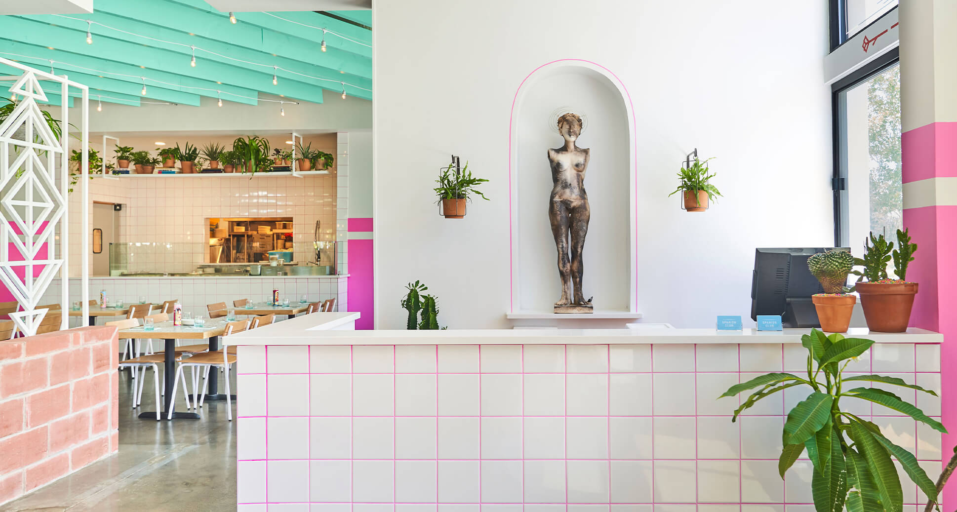
Sophomore Spanish Club (SSC) is the '90s themed Latin restaurant that’s taking Jackson, Mississippi, by storm. In an unprecedented feat, SSC combines two of my favorite things, '90s nostalgia with insanely tasty, authentic Tex-Mex flavors.
As a self-proclaimed “love letter to Tex-Mex and Latin food” created by “a bunch of gringos,” SSC checks every box for successful restaurant design: modern restaurant chairs, Instagram-worthy vignettes, bold colors, unforgettable details, and most importantly... images of Saved by the Bell’s A.C. Slater's rippling abs on the wall.
We sat down with designer, Mary Sanders Ferriss, Principal Designer at Ferriss & Company, the Mississippi-based design firm behind the interior to learn how she brought the space to life.
Can you tell us a little bit about Ferriss & Company?
We’re actually one of the only commercial interior design firms in Mississippi. My career began 15 years ago, I was doing luxury hospitality projects in D.C., which is where I learned the art of designing for the guest. Ferriss & Company brings that guest-centered approach to every project we work on, whether it’s a residence, an office, or a restaurant, creating the perfect space for the end user is key.
As a child of the '90s, I love everything about this interior, can you share with us where the Saved by the Bell inspiration came from?
The inspiration for SSC is actually rooted in the owners’ own quirky sense of humor. They’ve made a habit of personifying their restaurants before finalizing a concept, and A.C. Slater from Saved by the Bell just happened to be their muse this time around. They also have an upscale burger restaurant in the area called Fine & Dandy that drew inspiration from Betty White, and the interior there feels very “granny chic.”
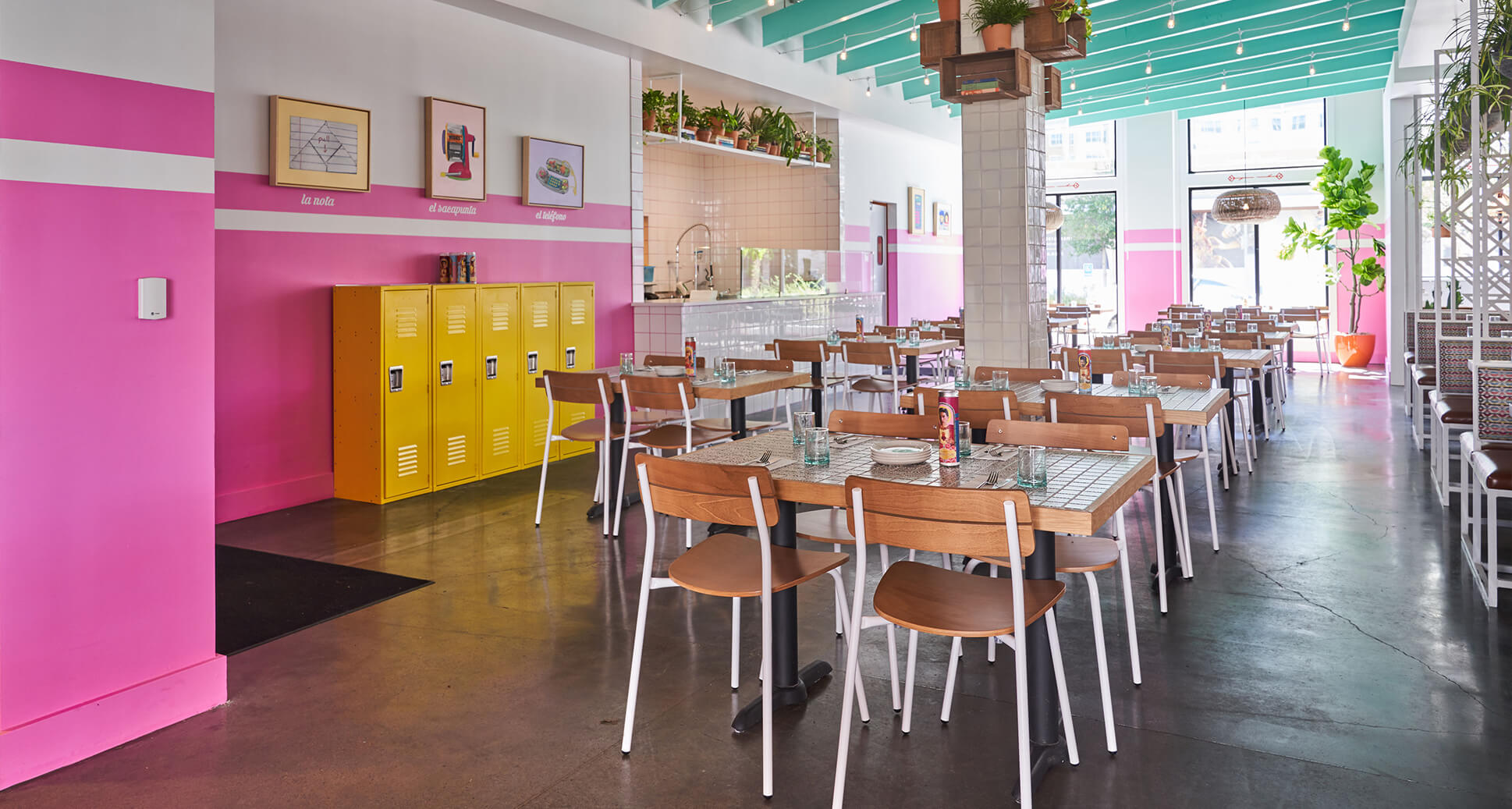
Coincidentally, every person on the development team (both owners, the chef, and myself), were all children of the '90s, so we jumped at the chance to interpret the decade in a really modern way. The real challenge though was transforming a space that was previously a chain restaurant (Cantina Laredo) into a restaurant that didn't feel or look like one. Although our chef studied extensively in Mexico, none of us have a Mexican background, so we did our best to infuse traditional Mexican design elements (patterned tiles, sugar skulls, and the altars) into the space without being gimmicky.
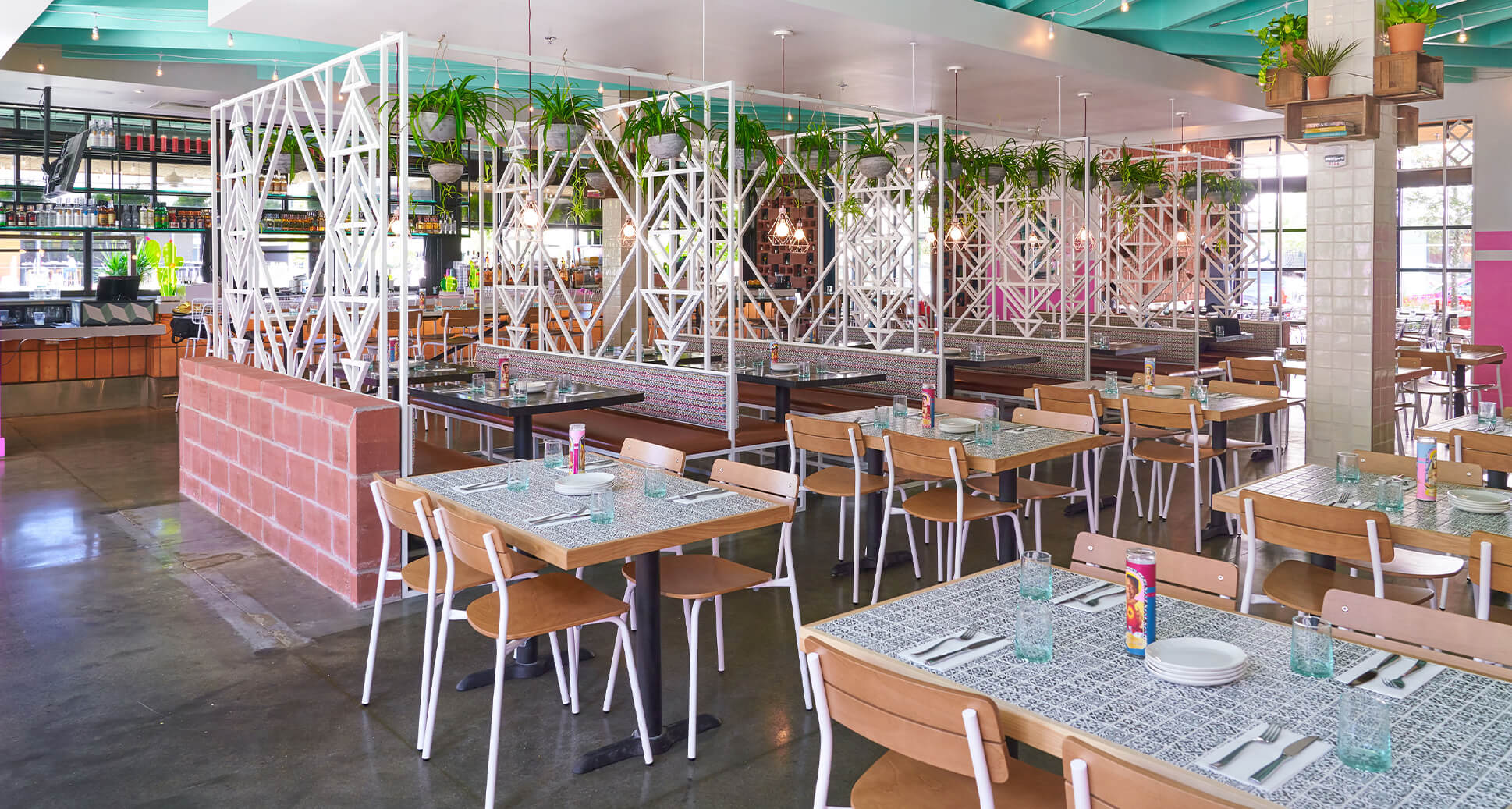
I'm drawn to all of the details that make this space so unique (like the iconographic votive candles and the wall art)! Can you tell us a bit more about how those were chosen?
To achieve eclectic look, we worked very closely with a variety of local artists to create the custom artwork you see throughout the space. We collaborated with graphic designers, illustrators, the signage company, and even the chefs to curate every single detail of the restaurant, from the menus and uniforms to the flatware and chairs.
Then our team layered in accessories, like school books, a varsity jacket, trophies, and even lockers to really bring that “high school Spanish Club” vibe to life. It's those subtle details that really create that special guest experience. It's our hope that each time someone visits they discover something new.
Talk to us about the furniture. What was the thought process behind your selections?
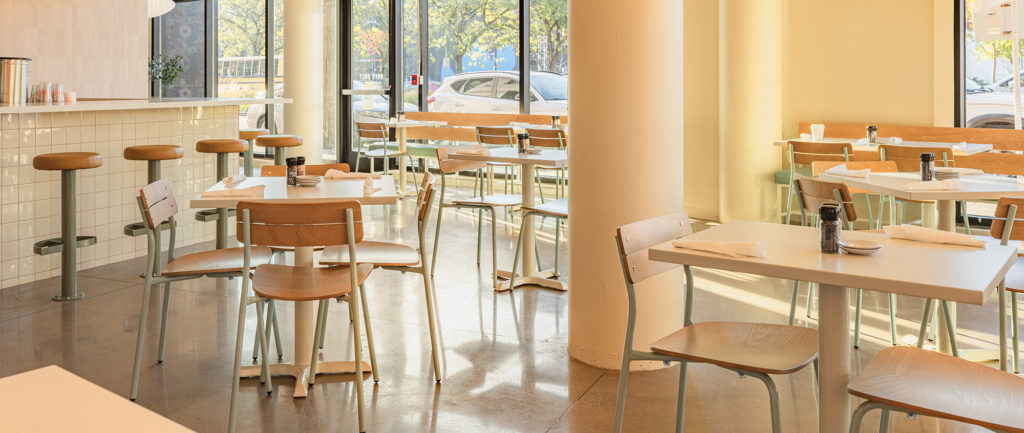
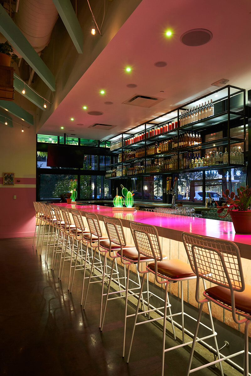
Keeping with the school theme, we chose the Sherman chair because it reminded us of that classic school chair, but was still really comfortable and modern. At the main bar, we opted for the the Opla barstool, the grid design on the seat and the back of the stool mimics the tile on the bar and reception station.
We loved the silhouette of the barstools so much that we decided to use the same outdoor collection on the patio as well. To create a more eclectic look, we paired the modern outdoor chairs with custom banquettes and older-looking tables we had found. The whole space reads as one cohesive environment.
Ferriss & Company managed to create a space that feels rich in detail without feeling overly-designed or stuffy. It's as if the objects were collected over the years. I personally love their commitment to a theme, the result is refreshing and joyful. If you like this space, be sure to check out Go Get Em Tiger, or Boss Rambler Beer Club.
