Three Things You Should Learn From El Thrifty, a Mexican-Inspired Cantina & Social Club
Learn how project leads created an upscale casual atmosphere where guests could spend a whole day enjoying themselves.
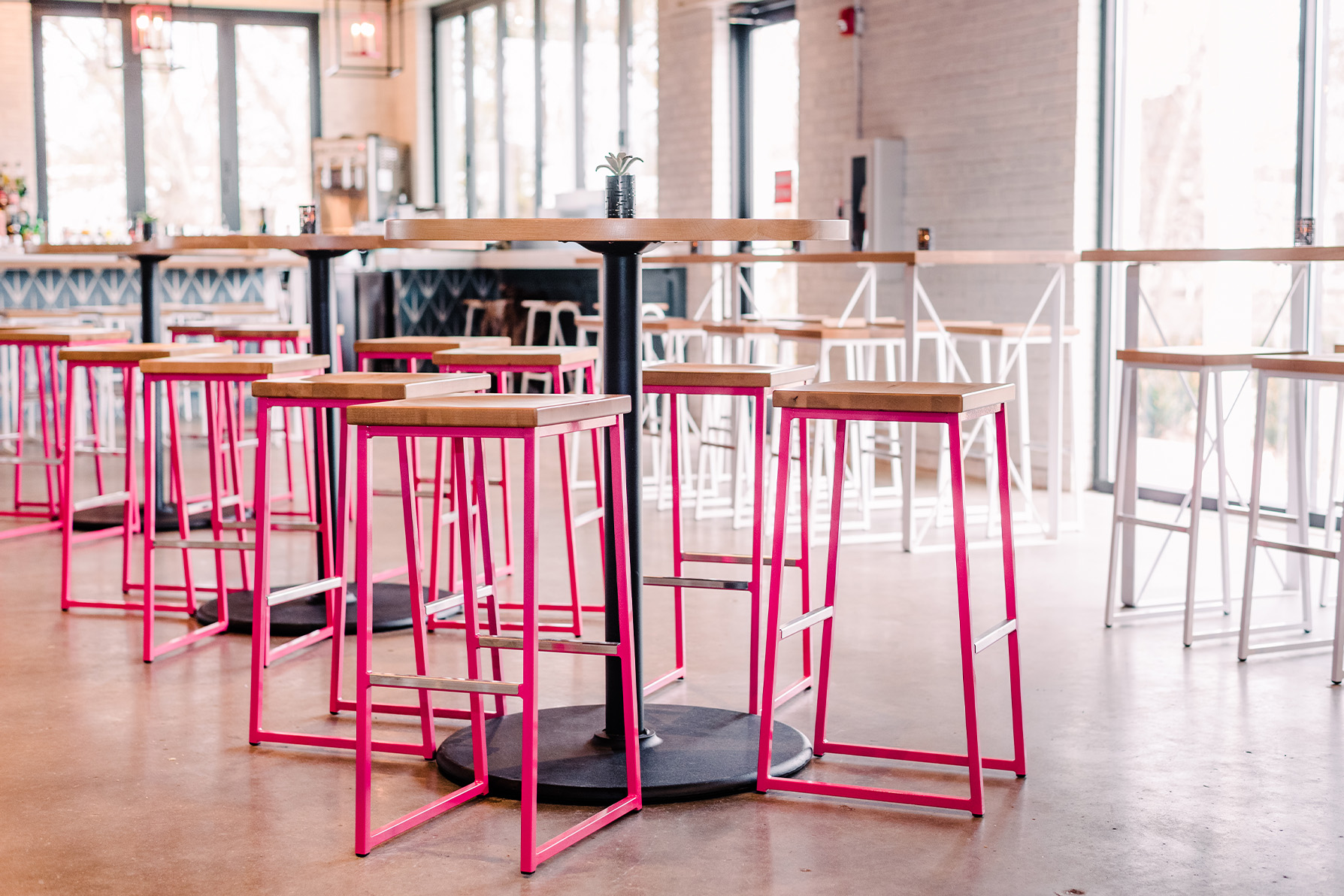
A wall of gold dusted skulls, fuchsia-colored barstools, and Mexican-inspired graphics are just a few of the design elements that make El Thrifty special. The all-day eatery and social club is expansive in size, with over 7200 square feet of interior space, and an additional 2200 sq ft of outdoor rec space featuring hammocks, and even shuffleboard courts. Located in Greenville, South Carolina, “el T” as the locals call it, is a refreshing concept for the area, and the owners are already planning expansion into other markets.
Their website describes el T as “An experience-driven, Mexican-inspired cantina, bar and upscale gaming venue... el T offers an all day menu that features authentic Mexican dishes created with fresh & locally sourced ingredients and a large library of spirits featuring mezcal and tequila for craft cocktails, local beer, wine & bubbles, starting or ending with locally roasted coffee.”
Managing partners, Robert Berry, Reid Olsen, and Andrea Ciavardini, are the trio behind the concept. They set out to create an upscale casual atmosphere where guests could spend a whole day enjoying themselves.
Once inside, you’re transported into a modern Mexican social club with pool tables, fusbol, and the largest feather bowling court on the East Coast. But what really caught our eye was the interior design. Designed by B. Berry Interiors, known for her fashion forward approach to interiors, her attention to detail, and her expert ability to layer textures and colors to perfection, el T is no exception. Berry is no stranger to creating jaw-dropping restaurants throughout South Carolina, just reference The Royal Tern, or Workshop if you don’t believe us.
There are three main themes we love about the interior design of this space: mixed-use, non-traditional seating options, bold colors choices, and a holistic approach to branding. Let’s dive into these in more detail.
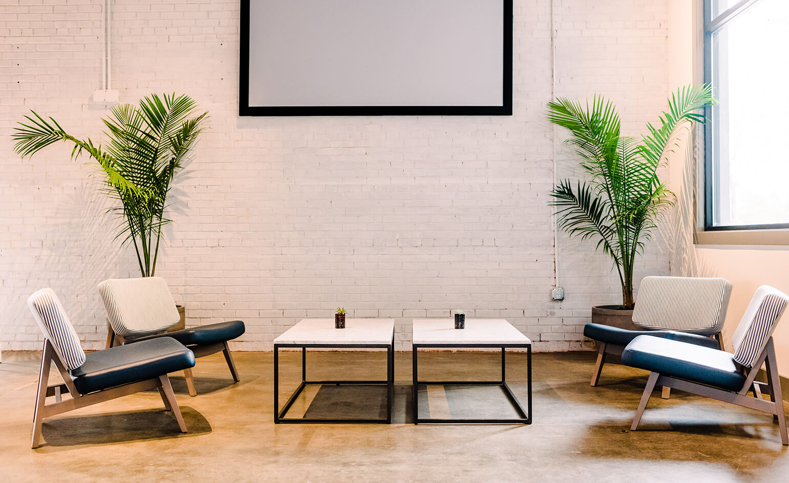
1. Mixed use, non-traditional seating options
The space offers a variety of seating options, from large communal tables to lounges areas with oversized sofas and even bleachers, each option allowing guests can choose their own adventure. Berry expertly used the furniture to set the tone for each area within the restaurant. Bleachers create a casual, sporty vibe around the pool tables, while the couches and Andy Lounge chairs offer up an intimate space to connect and relax, whether you’re there during the day “working from home,” or enjoying one of their tasty cocktails with friends at night.
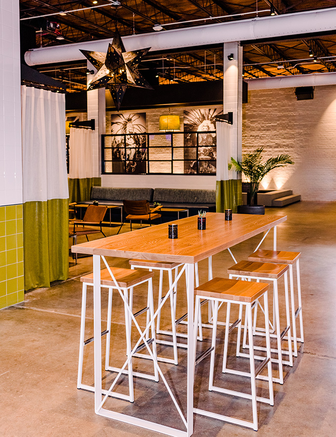
2. Bold Color Choices
At least in the North, it’s easy for Mexican-themed restaurants to go cheesy and cheap quickly, but Berry approaches this in a modern way with a nod toward tradition. Fuchsia barstools, gold skulls, and graphic tiles add the perfect pop of color. The space is grounded in grays and whites to keep things bright yet agile. The white furniture really stands out among the white oak elements and colorful tiles.
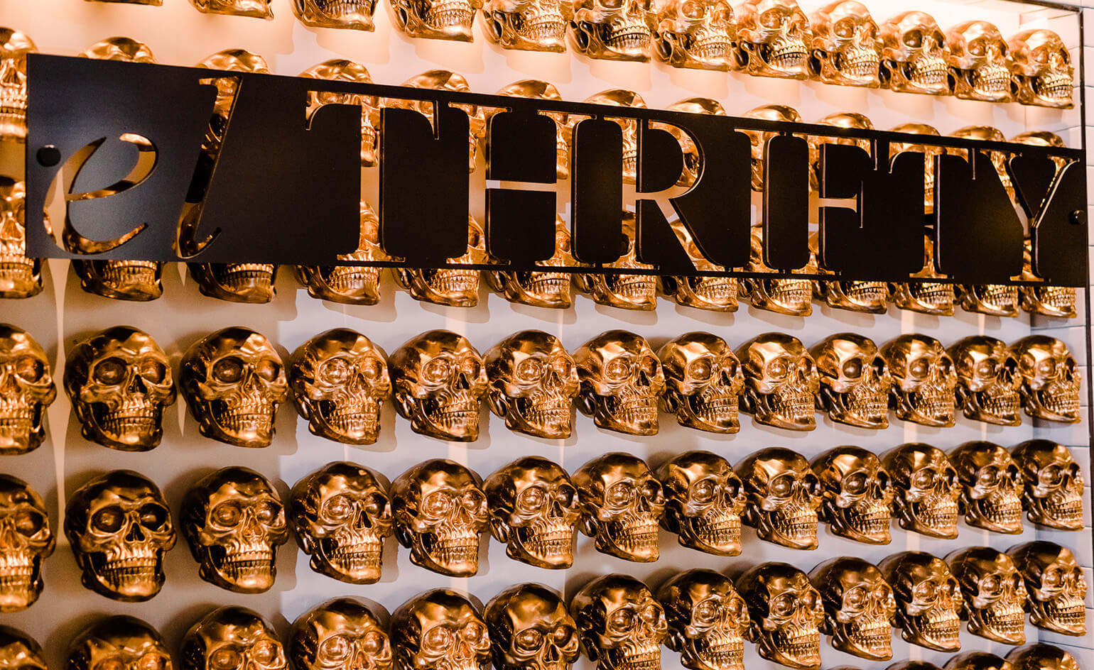
3. Holistic Brand Identity Throughout the Space
Graphic elements add whimsy while creating community. We live in an era of food delivery and boxed dinners, so creating a space as massive as el T is a risk on its own. Restaurateurs are turning toward branding as a way to draw people into their establishments by creating a vibe and a personality for their space, making it a destination. Berry and the team bring the space to life through the use of graphic way-finding signage, bold custom lighting, and hand-painted wall murals like the one above, just one of the space’s Instagram-friendly photo opportunities in this space. The team tapped local artists, Sunny Mullarkey McGowan and Suzanne Allen to create these on-brand murals both inside and outside of the building. These details add an experiential element of design and encourage guests to take pictures and post content, furthering that sense of community beyond their four walls.
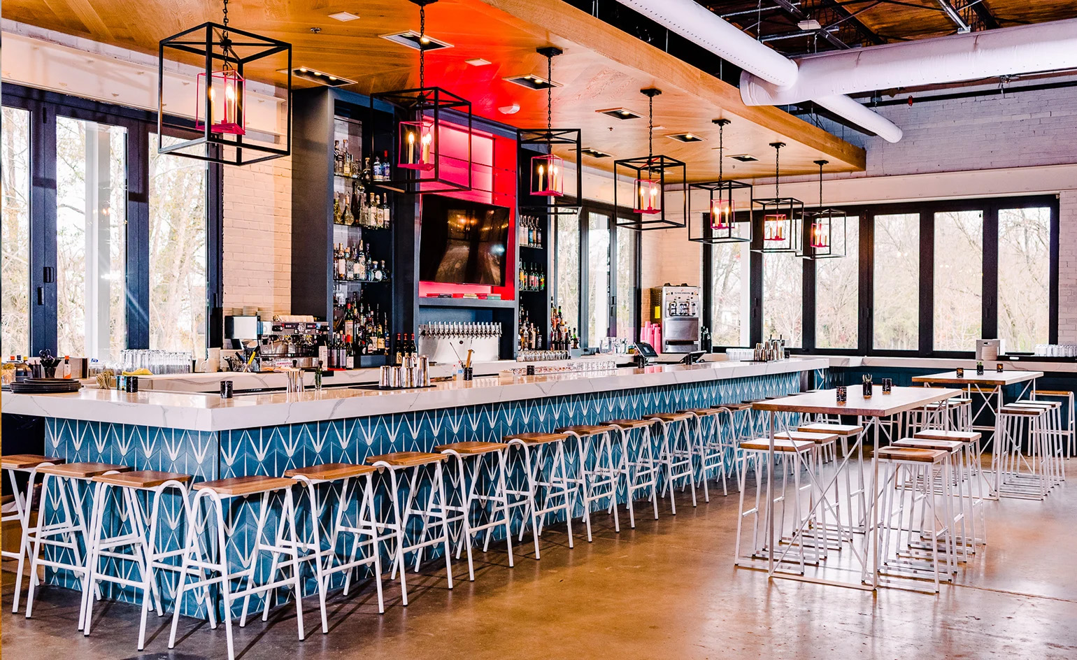
While the whole space is beautiful, one of our favorite areas is the bar, which is where you’ll find us if we’re not dominating the fusbol table. Glossy white Hurdle barstools are design-forward enough to stand on their own, but are minimal enough not to distract from the graphic cement tiles or custom lanterns hanging from above.
If you find yourself in South Carolina, El Thrifty is a must-visit! The space is a perfect example of modern dining and how to successfully create a destination within a community. The use of local artists, the expert space planning, and the bespoke details are what my tequila-infused dreams are made of.
