An Optometry Clinic that is a Sight for Sore Eyes
One of Seattle’s favorite optical shops has opened the doors of its second location with a desire to create a distinct experience that seamlessly blends healthcare and style.
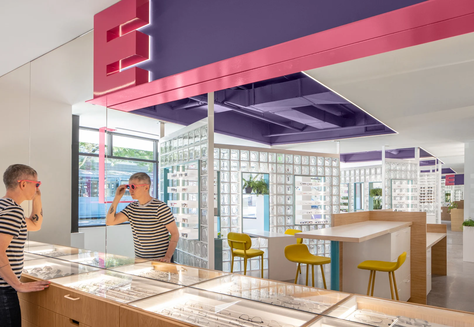
One of Seattle's favorite optical shops has opened the doors of its second location, which aims to bring a lively and inviting atmosphere. Driven by the desire to create a distinct experience that seamlessly blends healthcare and style, Eye Eye Care collaborated with the talented team at Best Practice Architecture, a small but mighty Seattle-based architecture and design firm that specializes in creating exceptional spaces. This partnership resulted in the transformation of a former salon in Seattle's Leschi neighborhood into a captivating space. By incorporating unique design elements, colorful aesthetics, and innovative materials, Best Practice Architecture successfully brought Eye Eye's vision to life, reimagining what an eye care clinic can be.
Where Healthcare Meets Boutique
Eye Eye Care, led by Dr. Will Pentecost, embarked on a project to establish a second location that would provide customers and patients with an exceptional eye care experience. Turning to Best Practice Architecture, the design team was entrusted with the task of creating a space that would showcase Eye Eye's curated selection of frames while offering a serene and safe environment for clinical services. Housed in a former salon, the new location presented a challenge due to its lack of street presence and low ceilings. However, armed with creativity and a refined design approach, Best Practice Architecture set out to surpass expectations.
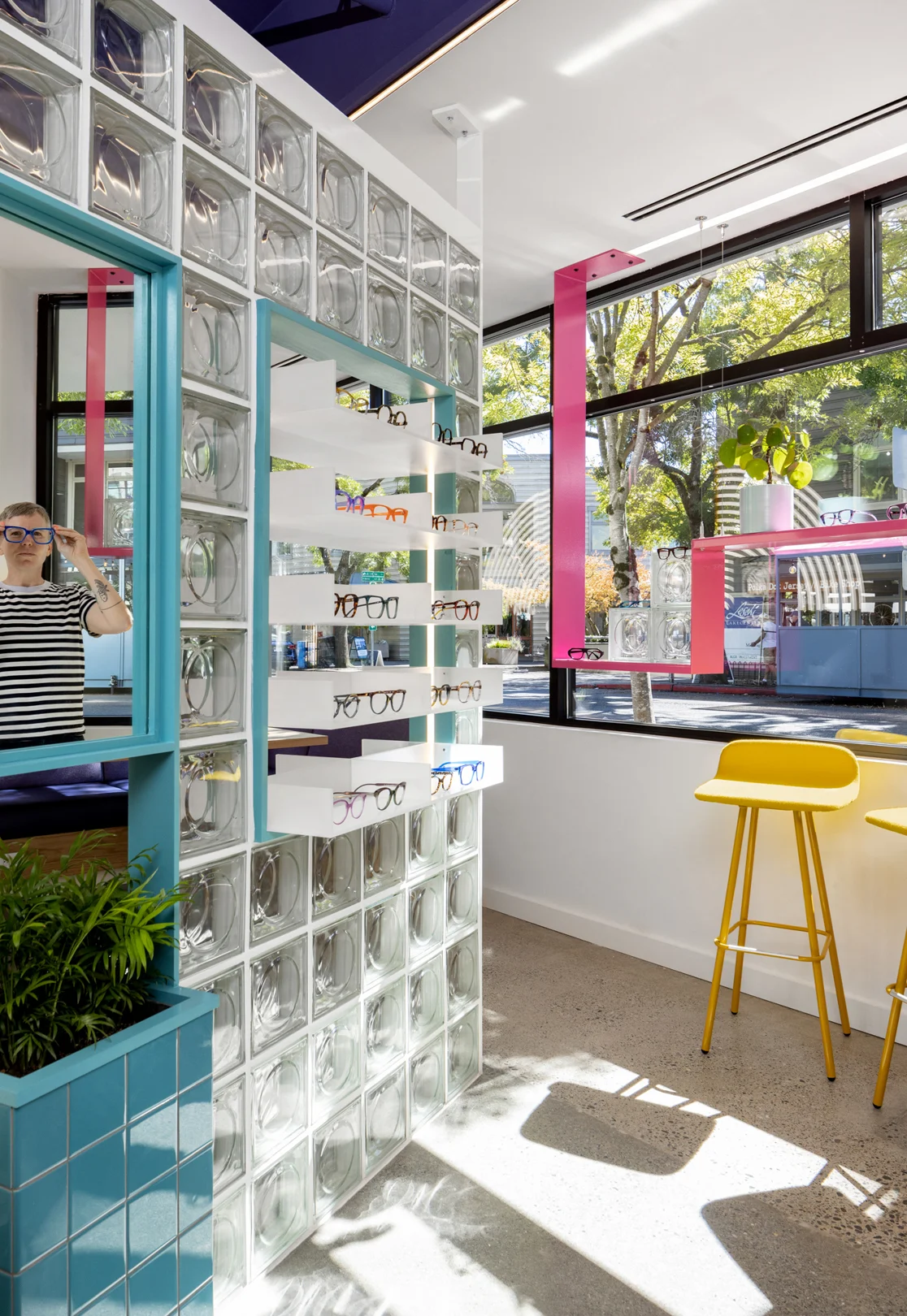
With the client's request to incorporate elements from Eye Eye's original location and create a unique yet connected experience, Best Practice Architecture set its creative gears in motion. The design team seized the opportunity to infuse the space with unexpected materials, vibrant colors, and custom signage inspired by Eye Eye's branding. Glass blocks, a recent fascination of Dr. Pentecost's, played a prominent role in the design, strategically placed to welcome filtered daylight and create an interesting circulation flow. The interior walls were opened up, painted in a bold purple hue, and paired with new lighting fixtures to amplify the visual impact of the space.
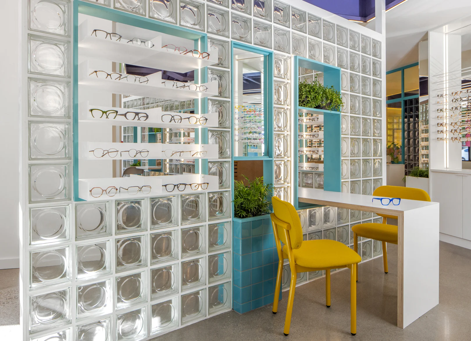
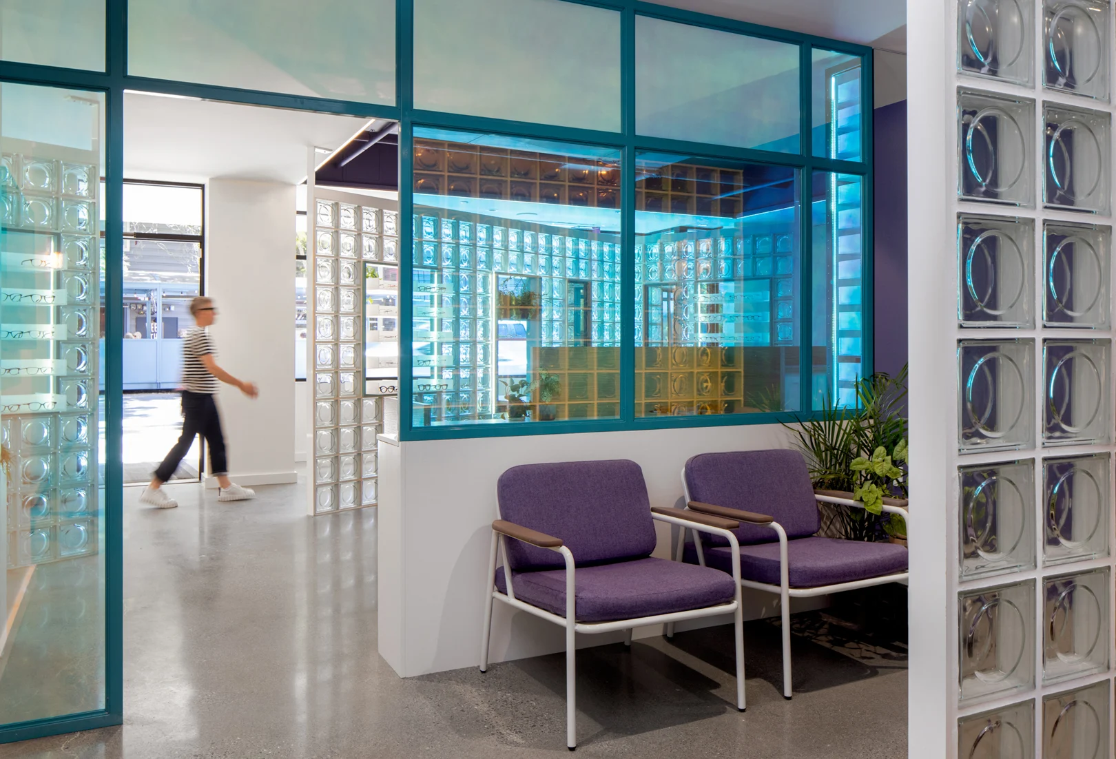
Throughout the clinic, a dichroic glazing technique was employed, resulting in translucent and reflective surfaces that not only provided privacy but also added a touch of visual interest and illumination. The retail area was skillfully separated from the consultation tables by a multifunctional wall system, featuring carved-out niches to display glasses and mirrors. The waiting area was adorned with a glass block wall, allowing natural light to permeate while maintaining privacy for eye tests. Eye Eye's characteristic custom medical equipment and warm wood cabinetry added a distinctive touch to the exam rooms, emphasizing the clinic's commitment to both functionality and aesthetics.
Comfortable Spaces to Empower Connection
For furnishing the Eye Eye Care clinic, Best Practice Architecture turned to Grand Rapids Chair Company, a trusted partner with whom they had utilized on previous projects. The customizable options provided by GRC allowed Best Practice to curate the chairs and tables to align with their design vision. The ability to select specific colors, fabrics, and finishes ensured that the furniture integrates into the overall aesthetic of the space.
"We know that if we're going to spec a Grand Rapids chair or table, it’s not only going to last but they're also going to be comfortable. We are familiar with a lot of Grand Rapids Chair pieces - we've brought in various models of chairs and have tested them out. It's just a proven product, plus the customizability of it is pretty unique - even the standard color options and fabric options are really great." — Sarah Smith, Design Principle at Best Practice Architecture
Best practice was able to tie furniture pieces into the overall color palette of Eye Eye by utilizing our Grey White and Honey Yellow finish colors and upholstery, adding to the bright and welcoming feeling of the space.
RELATED: Download our Color Finder Brochure to pick from 150+ premium colors.
In the realm of complementing a space, the beauty lies in the intricate details. According to Smith, the inclusion of furniture requires careful consideration of its appearance from every angle. Grand Rapids Chair Company fully understands this crucial aspect and offers chairs that boast captivating details, ensuring their timeless charm remains intact.
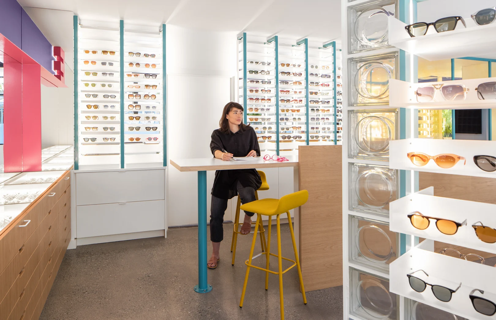
In the specific areas designated as touchdown stations for informal exams or trying on glasses, two standout pieces take the spotlight: the Ferdinand Chair and the Harper 4-Leg Barstool. The Ferdinand Chair steals the show with its upholstered mixed material composition, skillfully blending simple shapes into a functional design.
Meanwhile, the Harper 4-Leg Barstool boasts a sleek and clean design, characterized by a low back upholstered shell seat. This ergonomic construction offers a comfortable and unrestrictive seating experience. Perfect for those moments when relaxation is paramount, the Rita Lounge Chair was thoughtfully incorporated into spaces that demanded both comfort and ease of use. The Rita chair showcases a tubular steel frame with ladder-back detailing, exuding a sense of contemporary style.
Eye Eye Care required specific seating solutions to cater to various functions, including eyeglass fittings and informal exams. Working closely with GRC, Best Practice was able to find the perfect seating options.
"Eye Eye Care needed some really specific types of seating - seating that could accommodate a tabletop height that wasn't super standard. I remember going back and forth with one of the reps from Grand Rapids Chair about customizing the chairs beyond finishes so that they could be a little bit lower than a standard counter height. We ended up going with a standard counter and standard dining height for Eye Eye, but it was nice to be able to talk through some of the options and know it was available."
— Sarah Smith, Design Principle at Best Practice Architecture
The design team successfully created a unique environment that merged the clinical aspects of eye care with a boutique-like experience. The interior transformation, with its unexpected materials, pops of color, and playful signage, made the space come alive and provided an inviting atmosphere for both customers and patients. Eye Eye Care's vision of offering a healthcare experience that was inclusive, fun, and lighthearted was realized through Best Practice Architecture's innovative design approach. Did you love seeing the Rita Lounge Chair in this space? Check out the newest edition of the Rita Collection — the Rita Loveseat!
