Revitalizing the Phoenix Skyline — A Collaborative Interior Design Journey at the Punchcard Building
See inside the 18th floor of this iconic structure that has been transformed into a vibrant, modern space.
In the heart of Midtown Phoenix, a historic gem known as the Phoenix Financial Center, locally referred to as the Punchcard Building, has been given a fresh lease on life. Thanks to a collaborative effort between creatives at Full Circle Arizona and SPS+ Architects, the 18th floor of this iconic structure has been transformed into a vibrant, modern space that showcases the power of thoughtful interior design.
The Collaborative Dream Team
This venture was far from ordinary — it was a convergence of creative minds and shared bonds. The building developer, Ironline Partners, called upon Catherine Pieratt of SPS+ Architects, who spearheaded the project. She was joined by her close friends Lindsey Shepherd and Steffanie Murphy from Full Circle Arizona, alongside Jill Brey from Curated Contract Furnishings for furniture selection throughout the space. In collaboration with Jessica Berghoff of Berghoff Art Consultants, Jill Brey also contributed to a curated art package that supported whimsical moments throughout the space. Their profound connection and unified vision transformed this undertaking into what they affectionately term a "living studio project," merging their talents and design passions.
Breathing New Life into a Recognizable Landmark
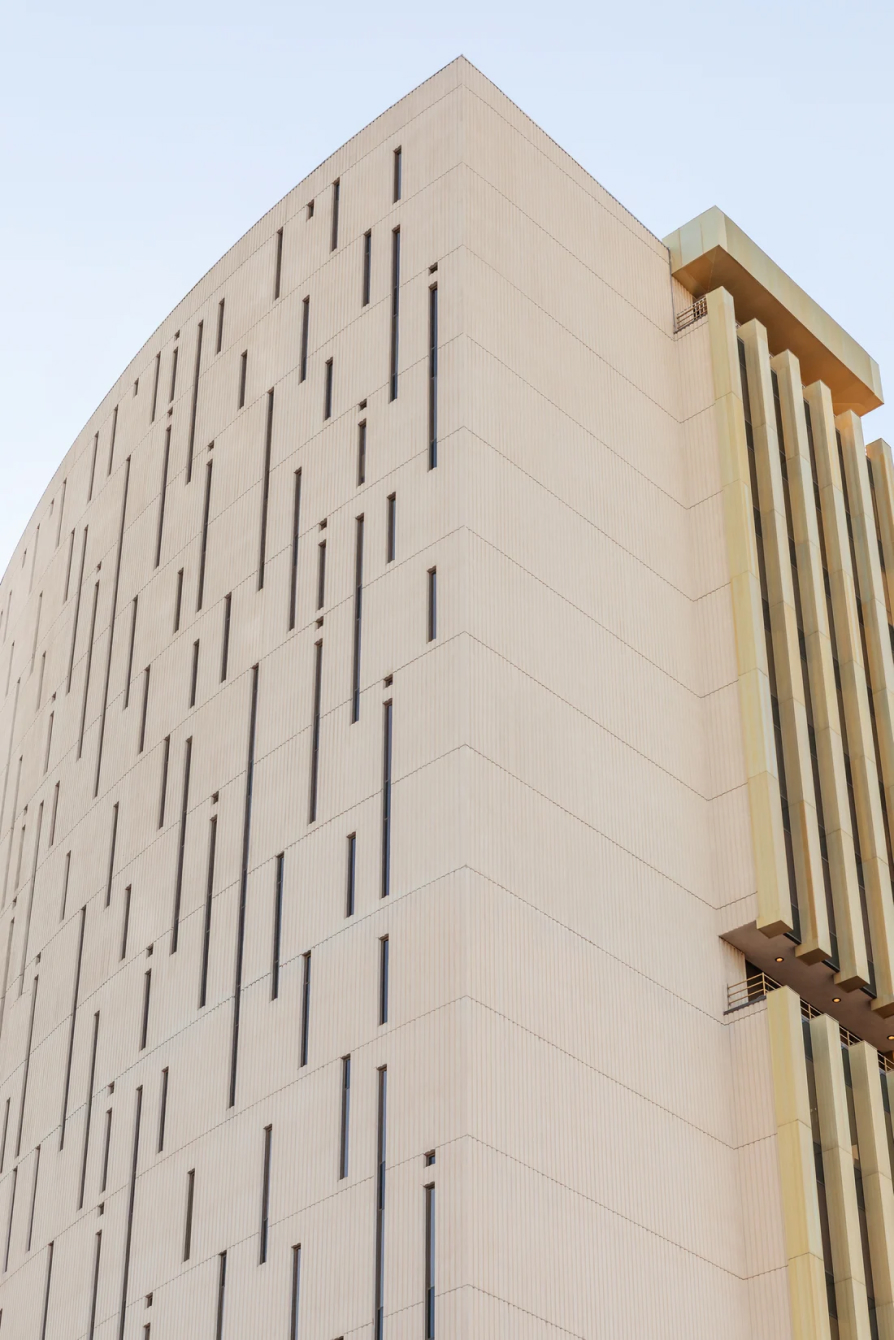
Known to Phoenix locals as the Punchcard Building, the Phoenix Financial Center, holds a unique place in the city's history and has become a recognizable landmark in the Phoenix skyline. Constructed in the 1960s, the building was originally home to banking and financial services and features a facade with narrow windows that resemble punch cards. Falling stagnant in design and improvements after decades of being limited by government leases, the Punchcard Building is now evolving into a modern, multi-use space with the intention of revitalizing the iconic structure.
The primary goal of the revitalization was to reveal the building's potential, especially in contrast to its lower floors, which remained trapped in the 70s with their outdated design. Ironline Partners, building owner and developer, wanted to break down walls and uncover the building's beauty — the 18th floor was the ideal canvas for this vision.
While the surrounding neighborhoods have undergone significant transformations, Midtown needed some love. This transformation aims to help revitalize the Midtown Phoenix area, providing a fresh and modern take on what's achievable in the city. The Punchcard Building project now stands as a beacon of change, inspiring further initiatives to vitalize the area.
Whimsical and Inspiring Elements
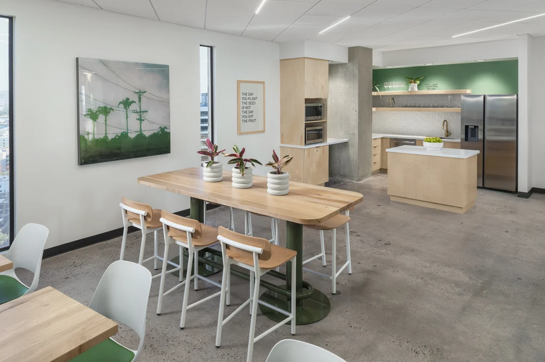
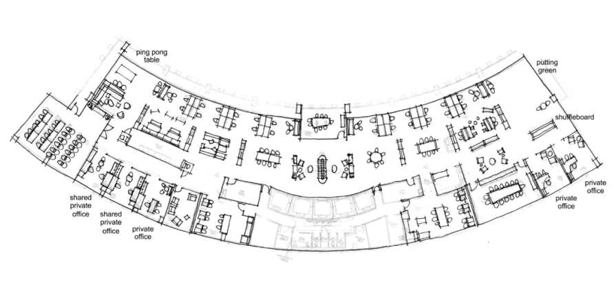
Full Circle and SPS+ Architects combined their talents to reimagine the interior of the Punchcard Building. The building's soft U-shaped layout provided a symmetrical canvas for their creative minds. The project encompassed the 18th floor of the building, featuring; two break rooms, offices and collaborative meeting rooms for Ironline Partners and SPS+Architects, and spaces suitable for future station rentals in a coworking environment.
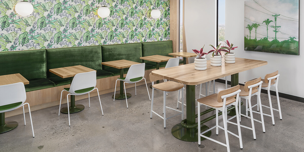
Art played a significant role in the project's success, enhancing the building's distinctive character. The design process revolved around captivating floral wall coverings that established the rooms' ambiance as fun and whimsical. Jill Brey, an art consultant at Curated Contract Furnishings, curated an art package including custom commissions and art pieces. This art component adds an extra layer of allure to the space, captivating all who enter.
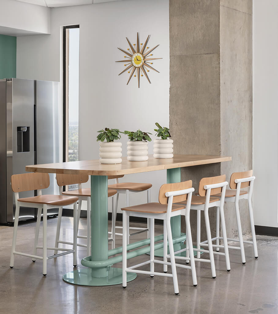
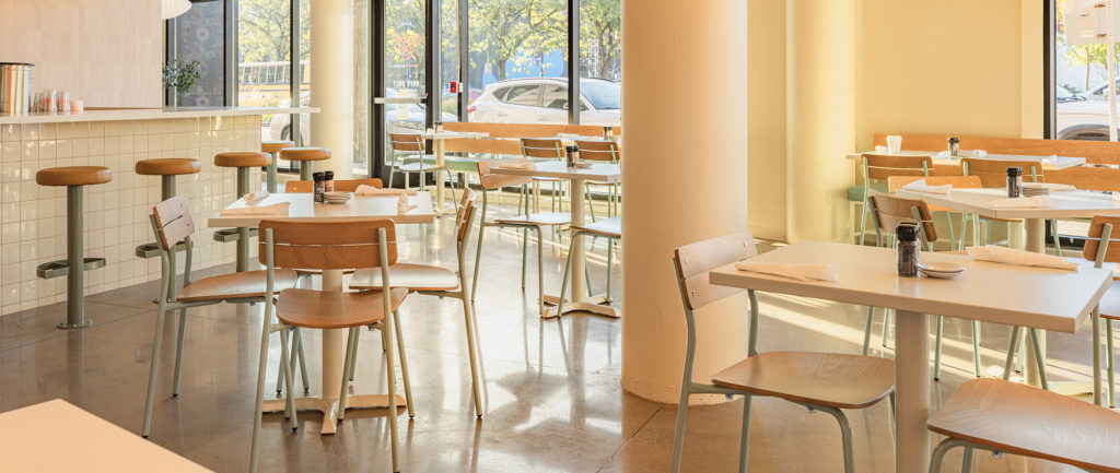
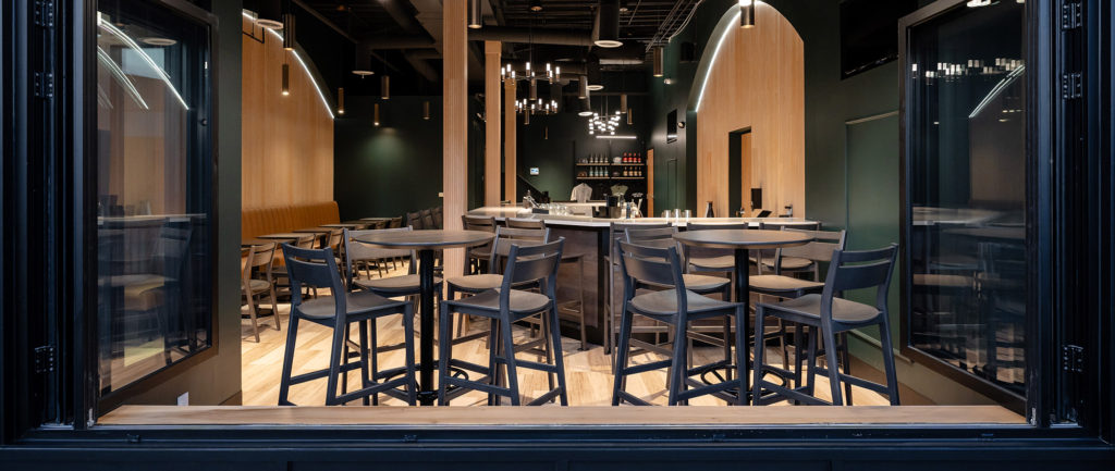
The design team chose to showcase Grand Rapids Chair Company's furniture in both of the breakrooms. Lindsey from Full Circle noted that the standard color options of Grand Rapids Chair's furniture lines perfectly complemented the chosen wall coverings, eliminating the need for a custom color selection. Visitors to the breakroom spaces are greeted by the Ferdinand Stools paired with the Frankie Bar Table, while the Orbit Pedestal Table, lines the banquette seating along the wall, creating a hospitality-inspired atmosphere.
While the building is not yet fully occupied, the 18th-floor space serves as an informal showroom for everyone involved. The team takes advantage of the spacious and well-designed area to host lunches, happy hours, and guided tours for architects and dealers, creating an inviting and inspiring environment.
A Design Story to Remember
From a neglected relic to a thriving, modern masterpiece, the 18th floor of the Punchcard Building embodies more than aesthetics; it tells a tale of collaboration, rejuvenation, and a respectful nod to the past. Full Circle Arizona, SPS+ Architects, along with their partners and friends, have breathed new life into a historical structure, leaving an indelible mark on Midtown Phoenix.
With a nod to its storied history and a vibrant, modern interior, the Punchcard Building is a symbol of Midtown Phoenix's renewed vitality. Whether you're an architect, a designer, or simply someone interested in the transformation of historic spaces, the Punchcard Building stands as an inspiring example of what can be achieved when creativity and vision unite.
